Can a wholesale brand shift towards online retail?
Website \ Digital Publishing
"Transparency in our manufacturing process remains a significant component of our production principles. "
1\ Research
The purpose of this digital product is to elevate the garment manufacturer Lux Los Angeles (Lux LA) from wholesale production to online consumer retail. Two products were designed for this rebrand: a lookbook and a website.
The lookbook informs the brand's graphic vision and the website curates an e-commerce experience; both aiming for transparency in the production process.
The lookbook
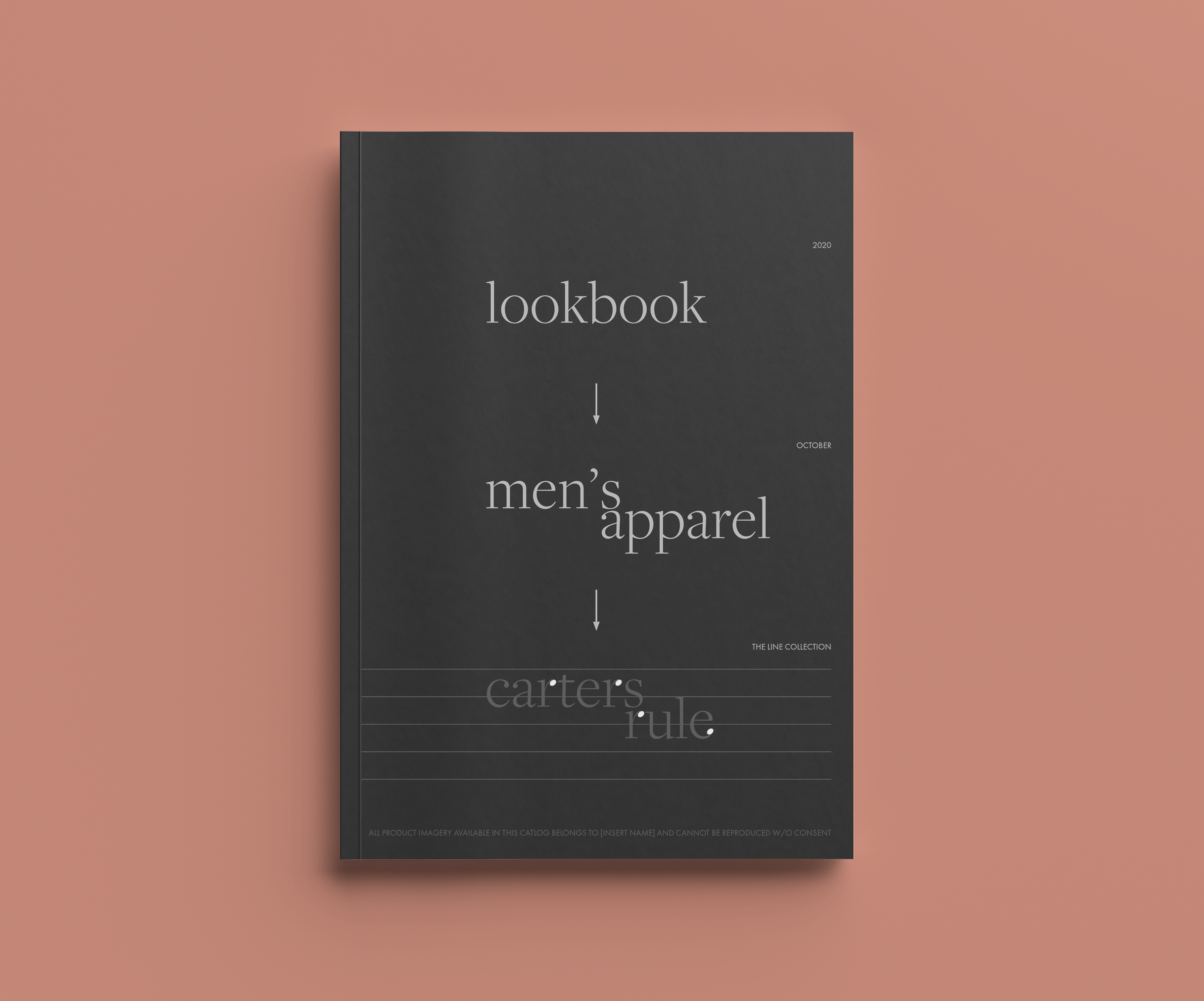
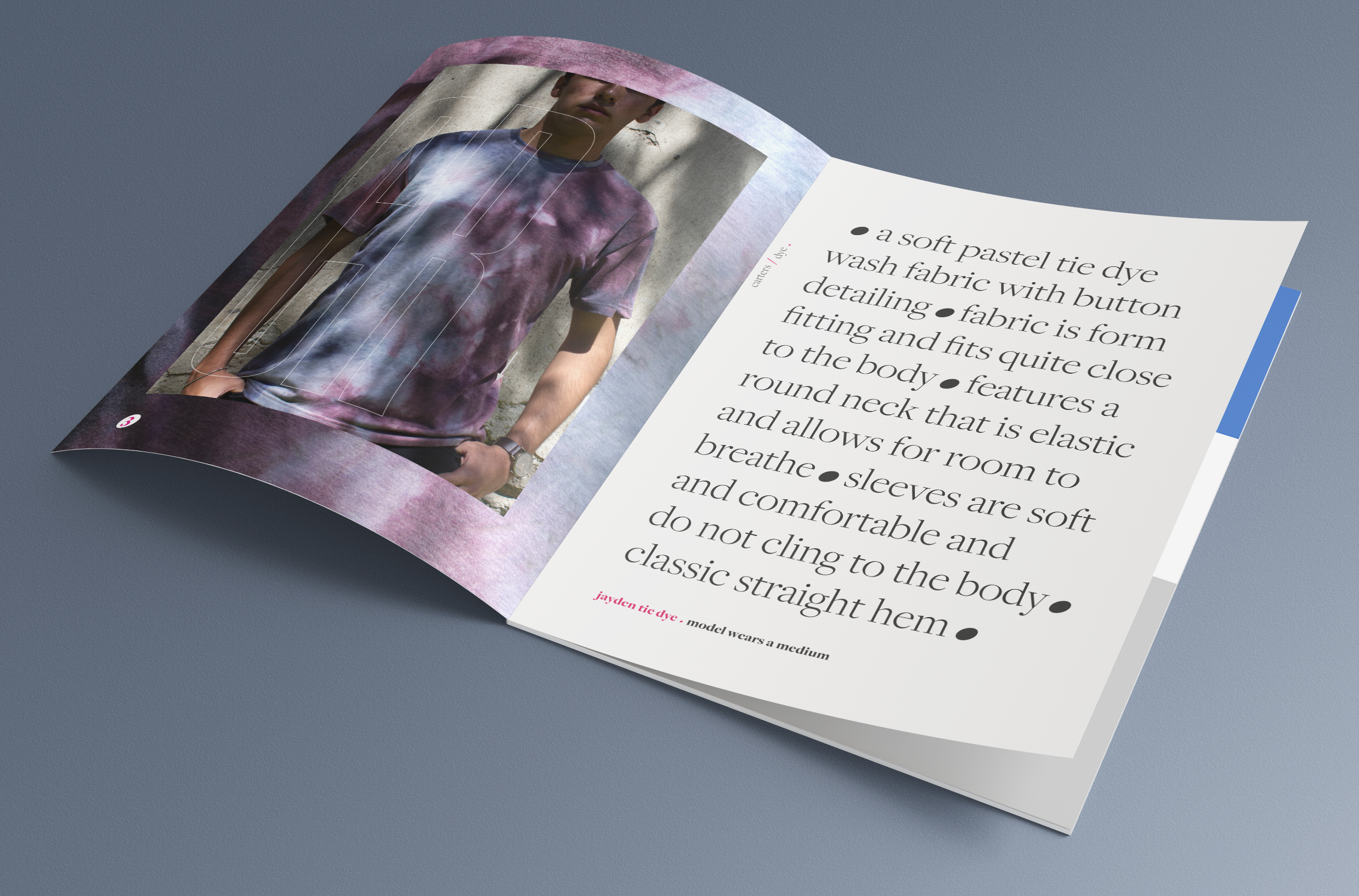
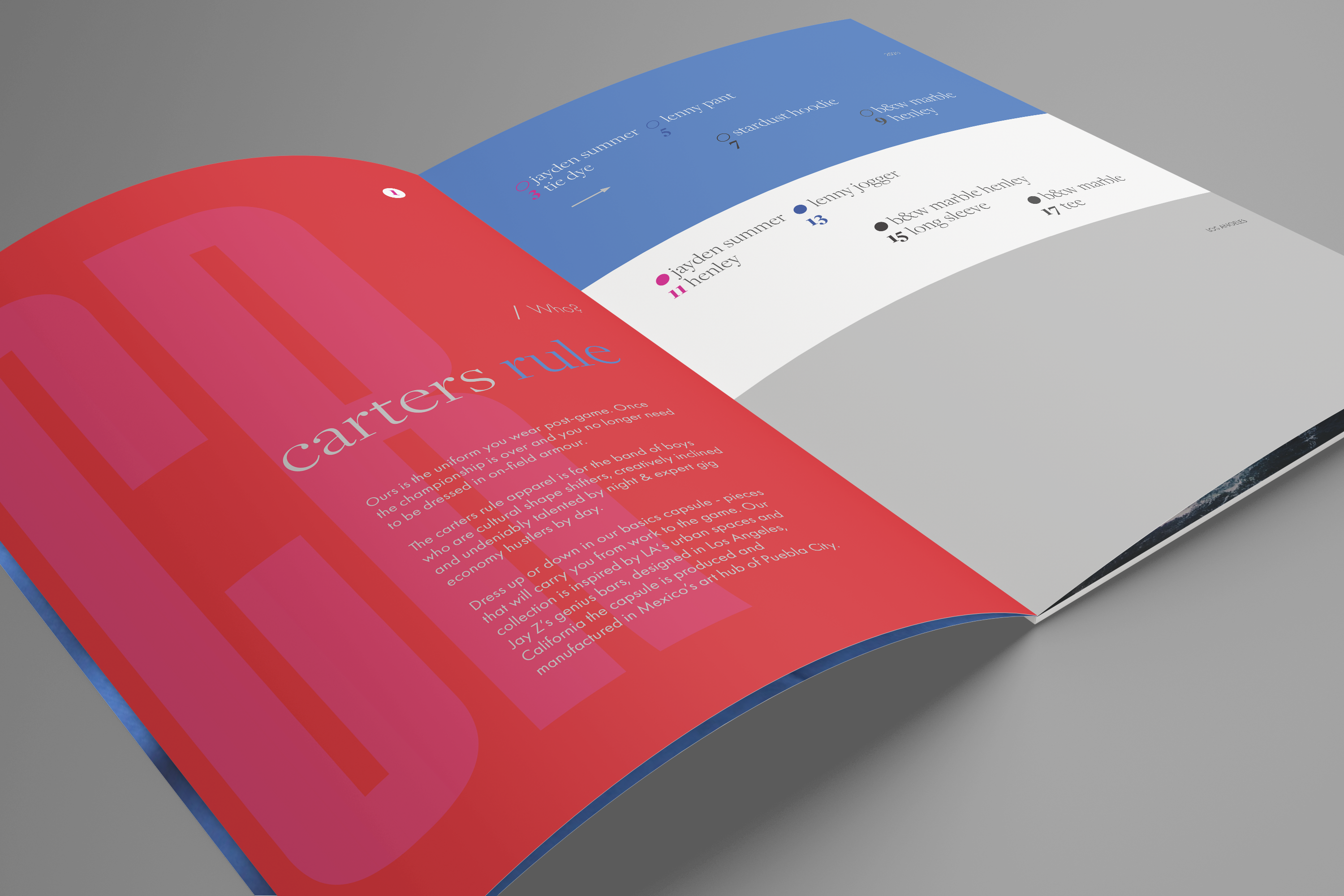
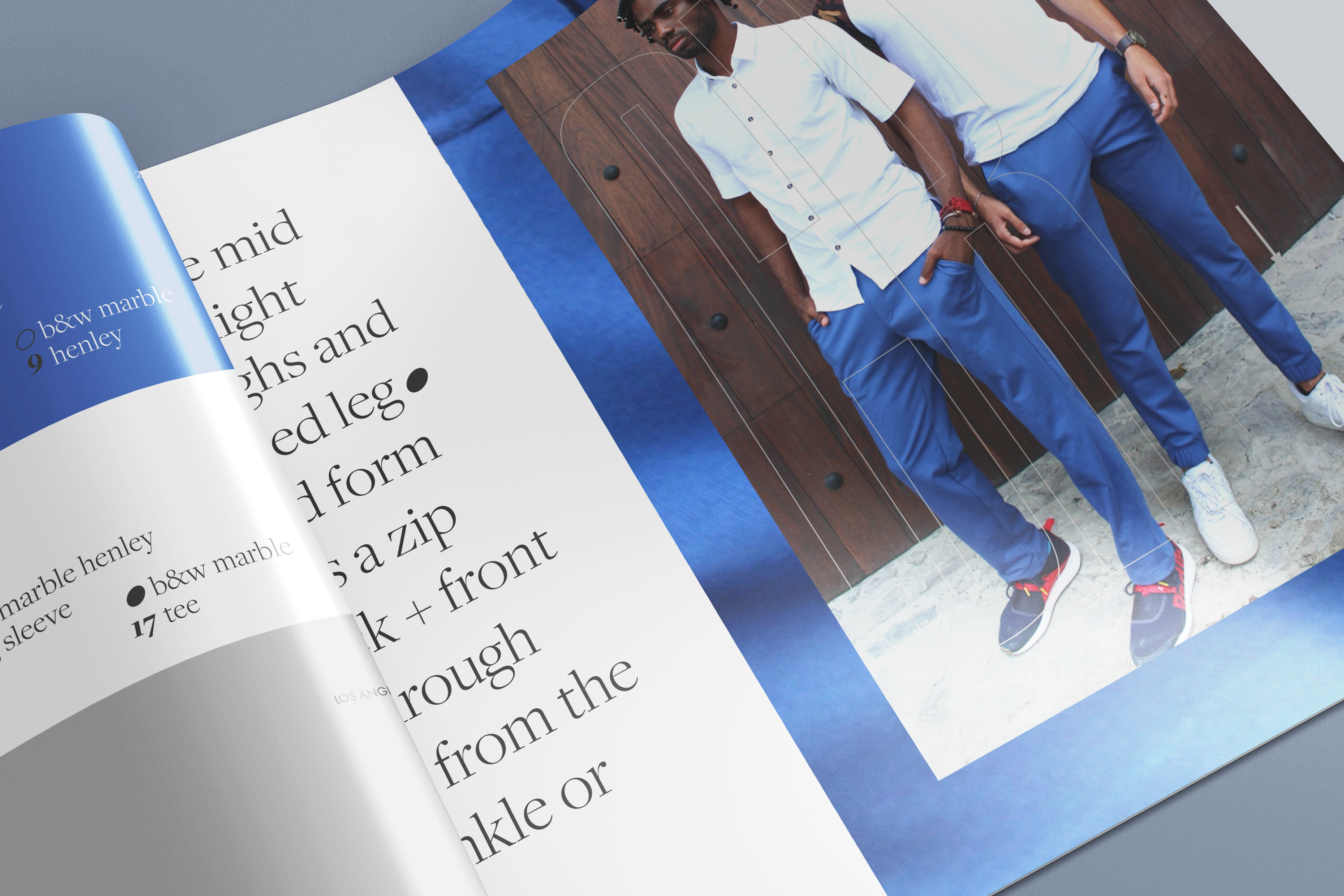
Before delving into an online roll-out, it is important to first define the look + feel. For the purposes of this exercise, we will use print publishing by vehicle of a lookbook, to distribute typography and textures.
As design for the two-page spread set evolved, content generation for the website and future publications became clear with simple messaging to compliment the fashion line.
What are the aspirations?
A boutique online experience. As the world moves towards digital platforms for their non-essential shopping needs, curating a website would allow more traction for the brand.
The aim with the first line; Carters Rule, is to appeal to a younger audience of metropolitan entrepreneurs who cycle through a host of social events weekly. The brand should maintain casual but durable luxury with clear messaging.
What are the principles?
Using sustainable fabric alternatives, particularly locally recycled materials, is critical to the idealogy of Lux LA. With a zero-waste agenda, the opportunity to create entire collections and using effective marketing, a sustainable strategy can be developed to deliver to eco-conscious consumers of fashion.
The by-product of wholesale manufacturing afforded the opportunity to create niche garments with far more control on fit but with the same focus on quality materials. The hope is to translate this as well, using transparent messaging.
Who's the competition?
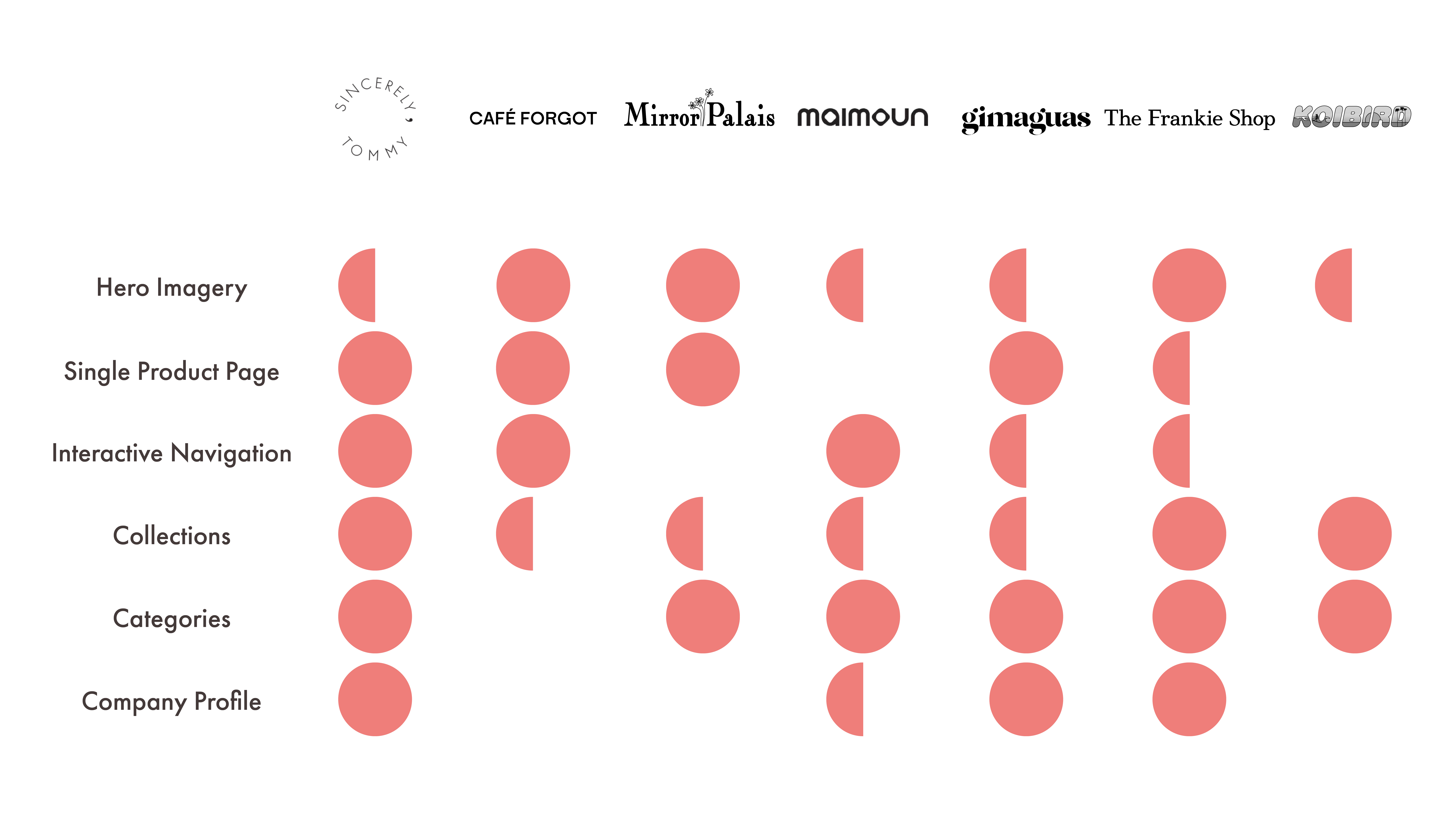
As we begin to think about the web presence of boutique online retailers, we would be begin with identifying e-commerce strategies executed by those in the industry. There appears to be consistencies in online strategies employed by successful portals, ones which provide fashion at your door-step.
From our research, we were able to identify several of their success to draw parallels. With our materials and production kept local to Puebla, it is important to feature some of these components for the Carters Rule online experience.
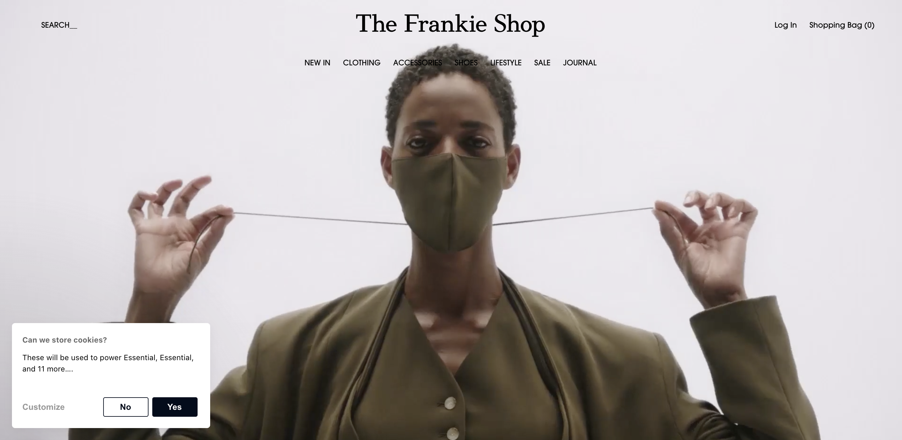
Hero Imagery
A hero image is a website design term used to describe an oversized banner image at the top of a website. Sometimes called a hero header, it serves as a user’s first glimpse of your company and offering because of its prominent placement towards the top of a webpage that usually extends full-width.
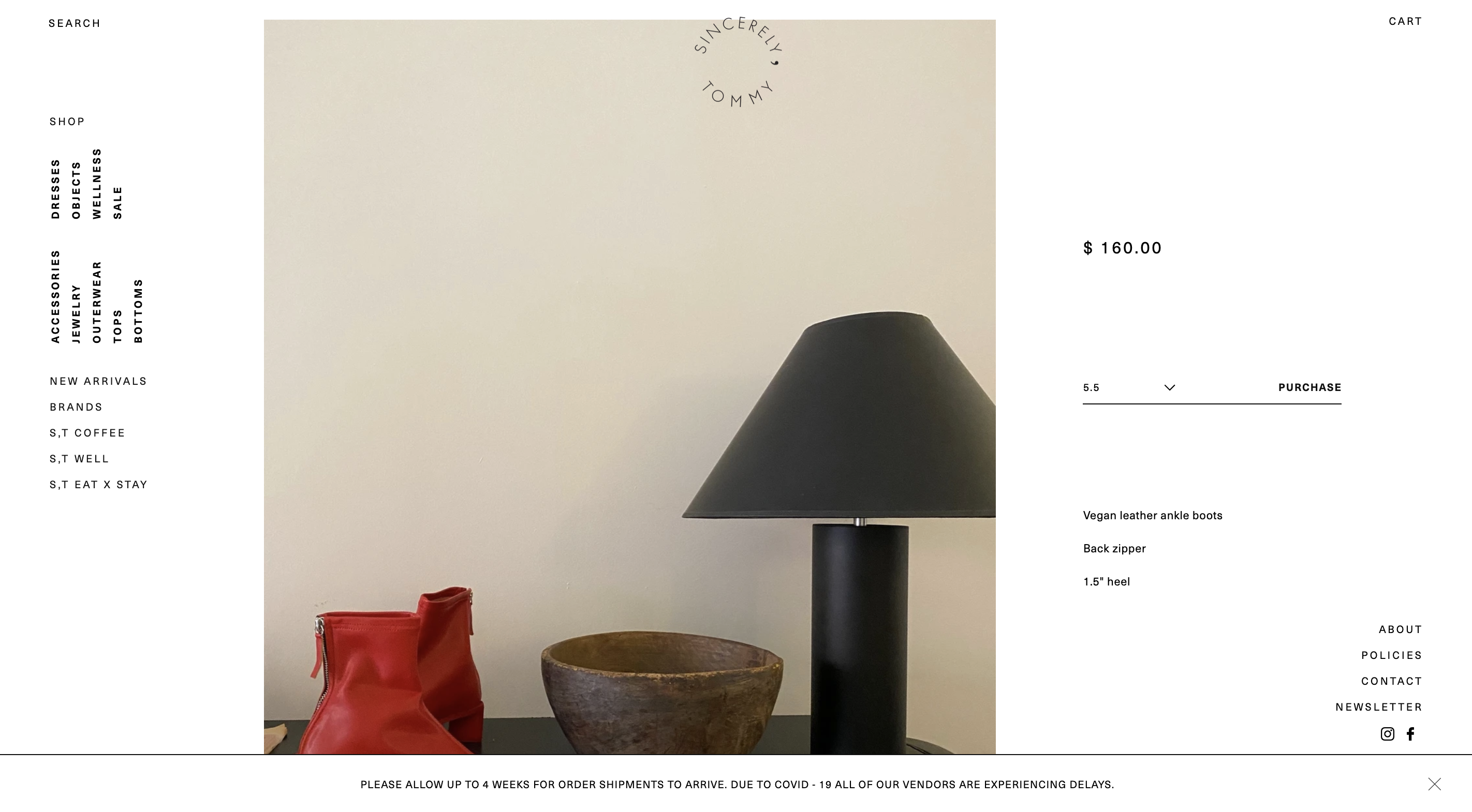
Single Product Page
Unlike a landing page, which is designed for a specific campaign, effective single product pages immediately convey the value of the featured product. They show shoppers what the product looks like, tells them what it feels like, and make them believe it’s something they absolutely need to own; all without leaving a single scroll layout.
Interactive Navigation
Creating an effective website navigation system is a crucial part of ensuring usability, and the success of a web design. Good navigation should be intuitive, easy to use and most importantly help your visitors find the content they’re looking for quickly.
As a customer interacts with the website, they leave a footprint. If this footprint can be represented graphically, as one peruses through a website, that allows for a unique user experience. A user wants to feel that they have customized their journey through the digital product, simply by navigating through it.
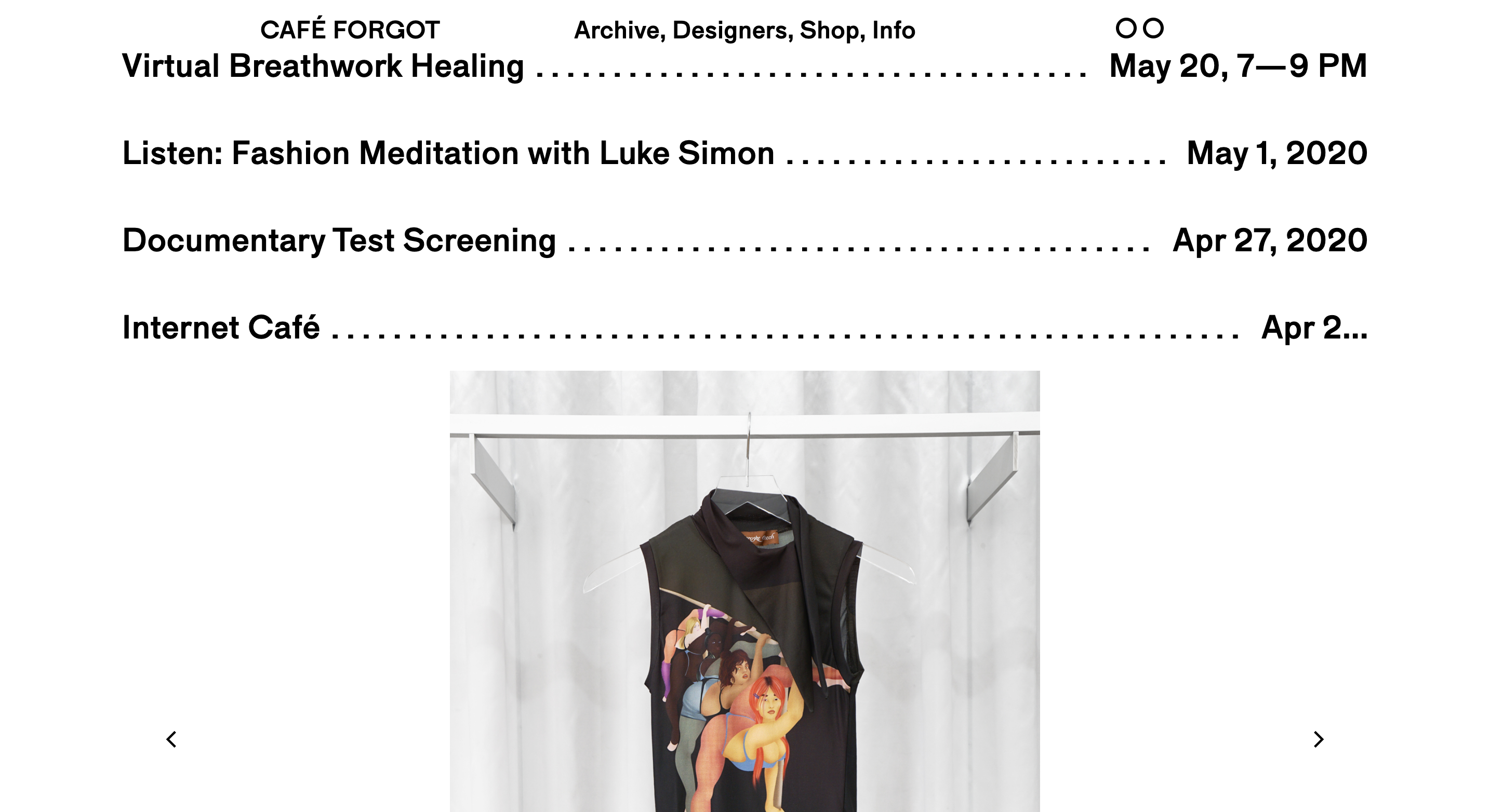
Collections
Representing collections from seasons or years is critical for the in-store and online boutique experience. Be this done in print via lookbooks or on a website using a tab feature, it is an opportunity for a brand to shine their brightest. Uninterrupted by price points and delivery notifications, this allows for a business to showcase their look and feel.
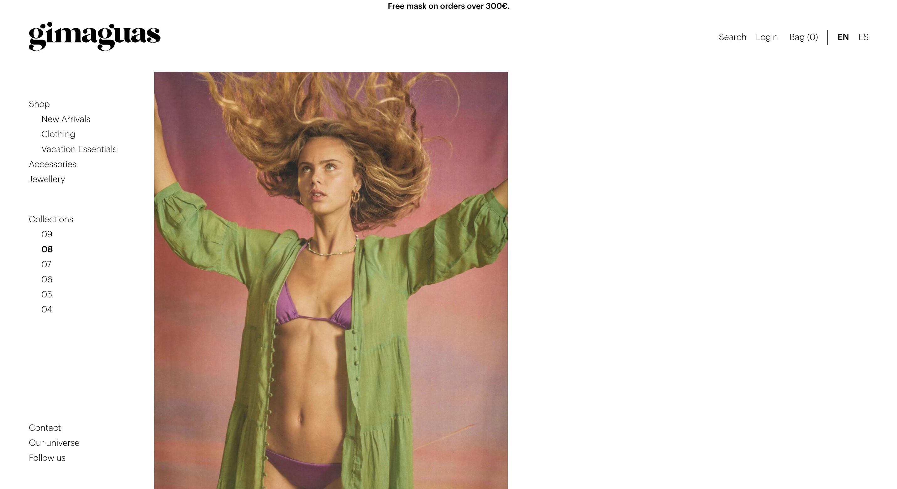
Categories
When you’re doing category page design, you must think about your audience and how they’ll browse your products.
Perhaps the most familiar page of the modern ecommerce website, hark as it does back to the days of post-order catalogues. With a structure based on long lists of various products, it stands, in some way, as a testament to human beings as creatures of habit- resilient to the pull of technology and the possibility of new ways of doing things. Yet, if you are willing, there is much that can be done digitally to make sure your category page doesn’t end up the same way as your catalogue, much ignored and resigned to the trash.
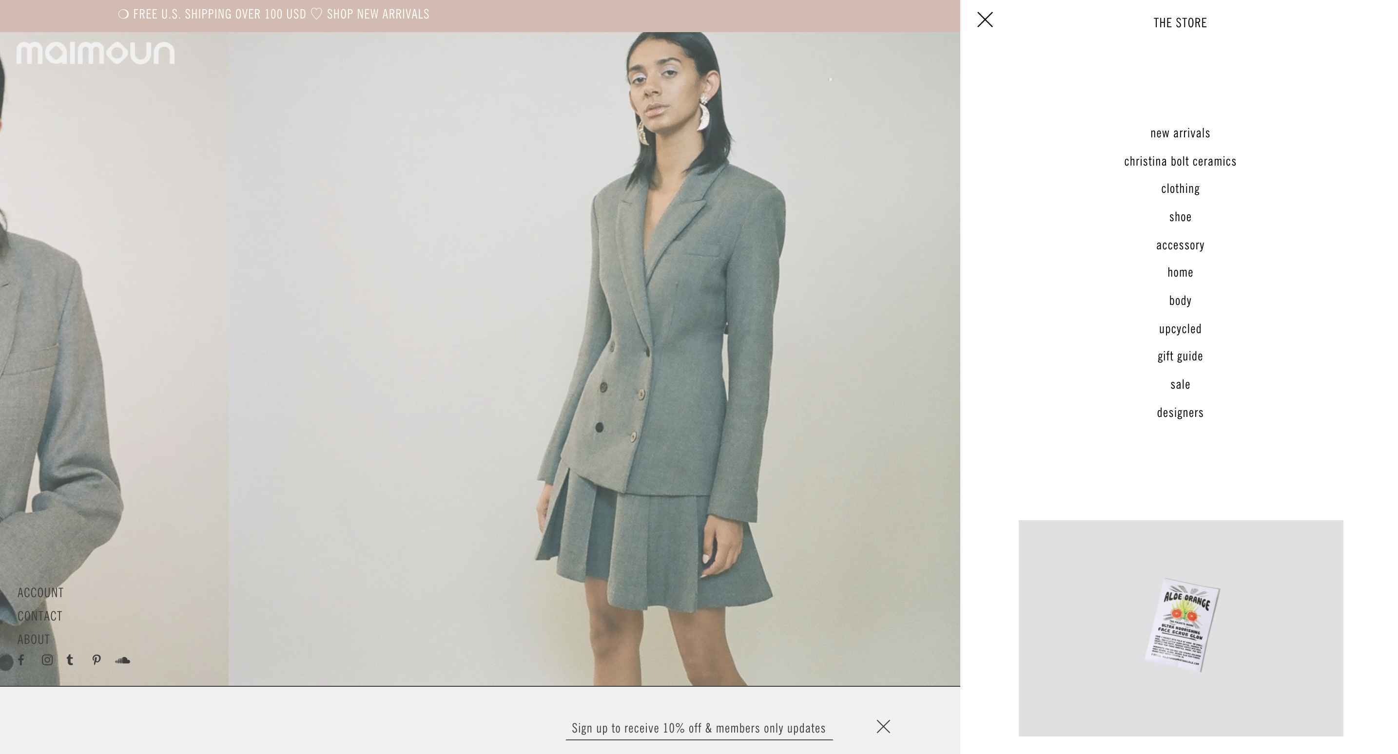
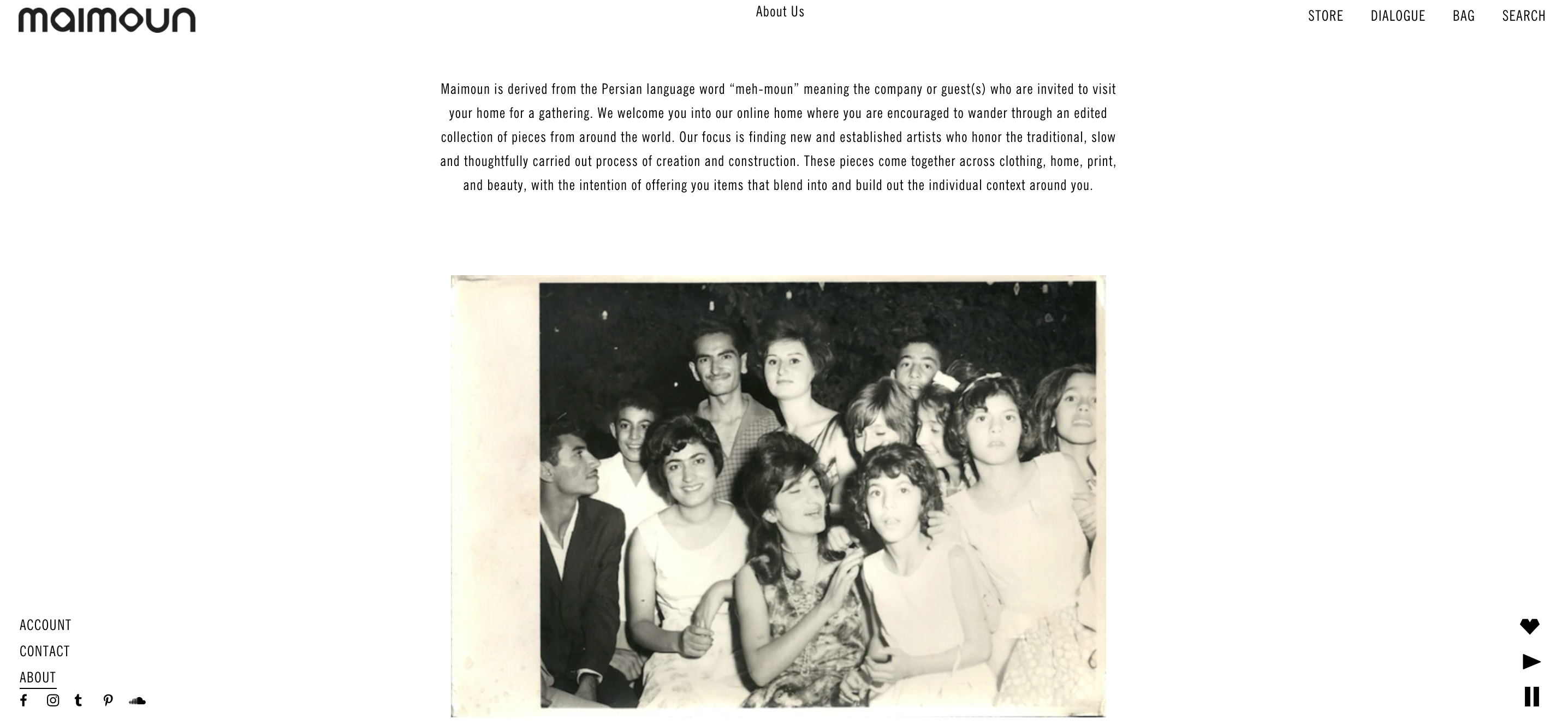
Company Profile
A company profile is an introduction to your business, and aims to tell an audience about your products or services. However, a company profile shouldn't just tell your audience what you sell -- it should also tell viewers why you sell it. A company profile often includes a compelling story about how the company began, as well as the company's vision and values.
2\ Define the user
Taking the market's current climate and digital tactics deployed by leaders in the online boutique retail industry have a sense for the functional and aesthetic ambitions for the digital product.
We do however need to understand the frustrations, motivations and aspirations of the intended user. This will differentiate the Carters Rule experience from other brands.
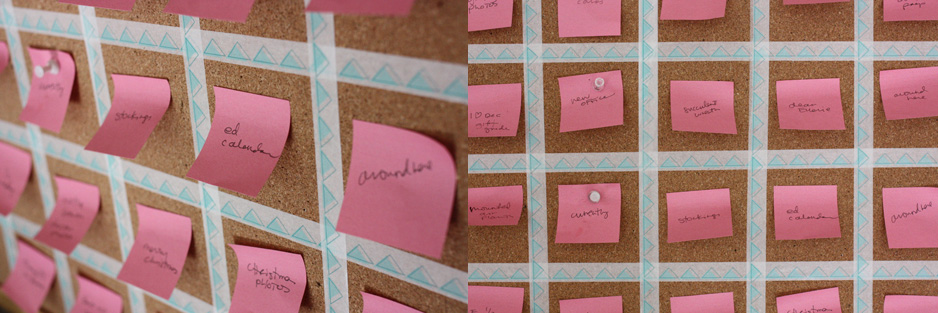
Empathy mapping
What does a boutique online experience look like? How important is transparency of the production process? Can a single product page feel substantial?
Without a human-centered design experience, a digital platform cannot function effectively. In the case of retail, it is important to provide a coherent understanding of the brand's mission, aesthetics and option availabilites without a clutered look and feel.
Let's meet our user!
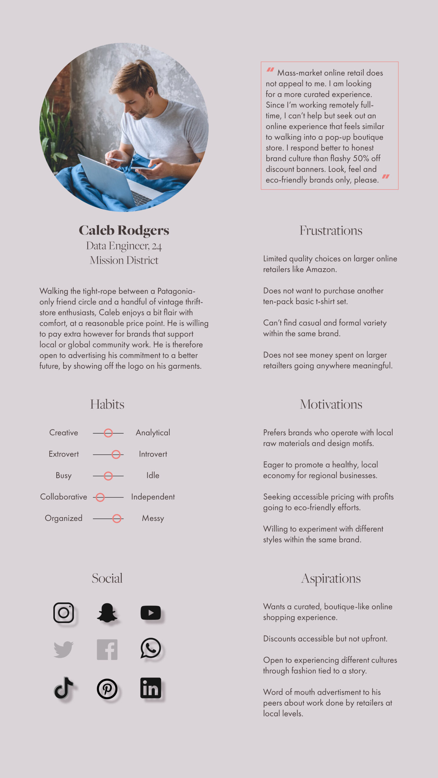
Based on the research, a persona was mapped to illustrate categorical motivations, frustrations and ambitions for boutique online retail.
Caleb finds online shopping his primary portal towards accessible fashion. He does however find the disconnected collections, poor quality, reliance on customer reviews and lack of brand ambition statements disconcerting. His fashion goals align with his desire for an eco-friendly future and is willing to pay a surcharge for improved quality if it also means moving towards a decentralized e-commerce ecosystem.
3\ Ideation
Creating an enviorment for customer to product interaction requries curation. An online shopper should feel they are able to understand the parameters of the experience in four scrolls or swipes of their laptop or smartphone respectively.
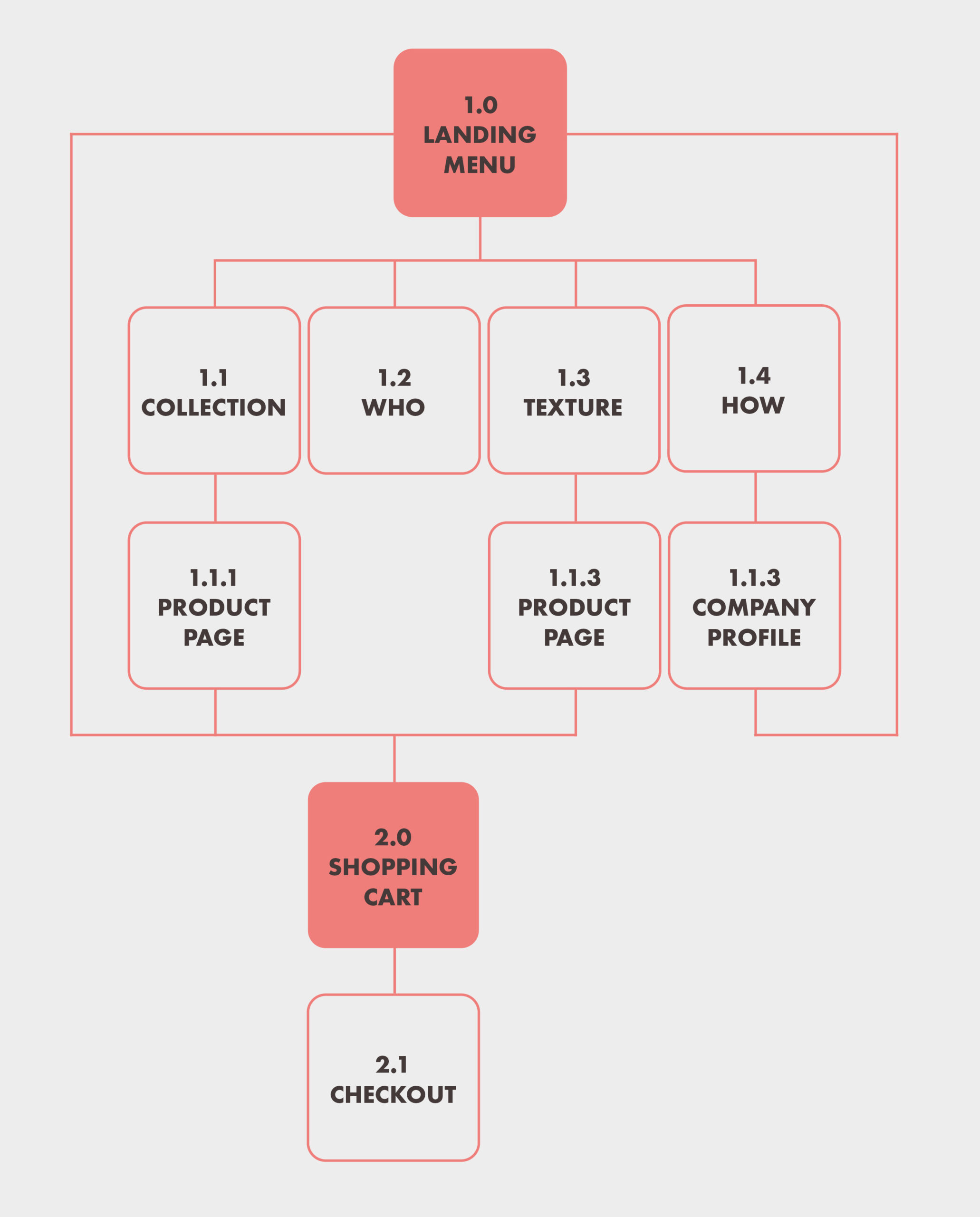
Keeping a map that is organized in concept will allow for it to maintain clarity and the website evolves.
Site mapping
The goal for this product; to limit any interactions outside of a single page whenever possible. While subsidiary pages hosting product descriptions and features of the manufacturing process in greater detail can be navigated through the landing page, its primary components will exist using a single interface.
Checkout windows and shopping carts will be designed as overlays once Carters Rule moves into the e-commerce leg of its journey.
Keeping your data safe
During this period of uncertainty regarding the procurement of user data for distribution to advertisers, we must be cautious when shopping online.
Linking secure payment widgets such as Apple Pay and PayPal will allow for added security. Guest profiles will not feature in for the first sprint of the Carters Rule launch. This will deter any personal information being hosted for public use.
4\ Let's design this!
Employing all the motivations, aspirations and cautionary tales from our research and user personas, while utilizing our toolkit of successful features designed by competitors, we will create our first sprint.
Carters Rule's website will be designed using WordPress.
Landing Page
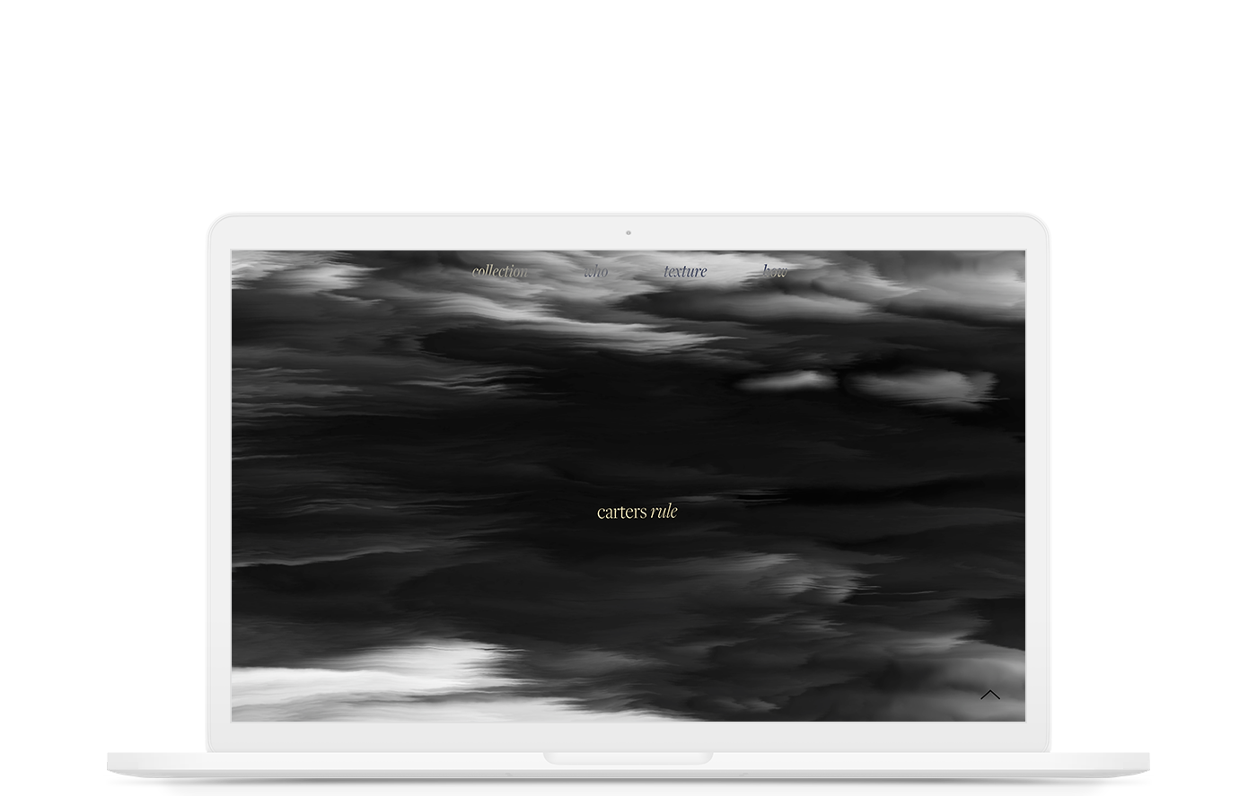
A grayscale displacement map animation with 3D tilt shift interaction is used as the canvas for navigation menu items to dissolve through. The intent for the second sprint is to fade into more macro photographs of the fabric line with similar animation activations for an close up on premier quality garments.
Collection
The user should feel that their footprint has impacted the website which makes their experience unique to them. Creating lazy loads for the collection allows for use customization to exist, giving one ownership of the number of products they can see.
Who
The intention behind the line features in as early as the second component of the four scroll spread. Lux Los Angeles' hope to create transparency for the design and production process is influential for their brand.
Texture
Similar to the product collection, the fabrics available from the wholesale process are also available for customers to browse through. Whether or not they will fall into the checkout overlay option is to be determined so the architecture has been designed to allow for that capacity. As the fabric collection expands, a similar lazy load animation will be injected into the gallery.
How
A brief into the history and production principles tail-ends the page. For additional information and factory certifications, the following window opens with a colored ease-out delay to keep customers invested in the UI Kit of the website experience.
Product Page
Finally, each product has a dedicated spread limited to the width of the desktop-wide format hosting a slider gallery and product information. A simple interface gives the online shopper a cohesive experience into each piece, citing relevant details within the same window.
5\ Meet the Team
Hi! Our team is looking at bridging the gap between business-to-business and business-to-consumer retail employing online platforms and print publishing.
Our hope is to re-invent e-commerce navigation strategies in the process.

Aisha Masood
Product Manager

Ali Sherazee
Operations Manager

Farhan Mian
Product Designer
FARHAN MIAN
User Experience Designer
User Interface Designer
Architectural Designer
CONTACT ME
farhanahmedmian@gmail.com
CURRENT LOCATION
New York, NY

