

Can we reduce patient waiting time during a global pandemic?
Mobile App \ Healthcare
"The hope is to integrate digital interfaces into our operations and limit exposure risks to COVID-19 by reducing patient waiting time at clinics and hospitals."
1\ Research
Delays in the office due to administrative lag, insurance processing times or extended appointments with doctors can be tracked in real-time.
Now, with an airborne viral outbreak, this is no longer deemed a luxury service. Optimizing efficiency and resources to reduce patient wait times could limit superspreader scenarios.
What's the market?
Healthcare reform brings with it a market climate that is increasingly customer-driven. The elevation of hospitality provided by clinics and hospitals in recent years affords an enhanced patient experience and thereby customer loyalty.
Transparency
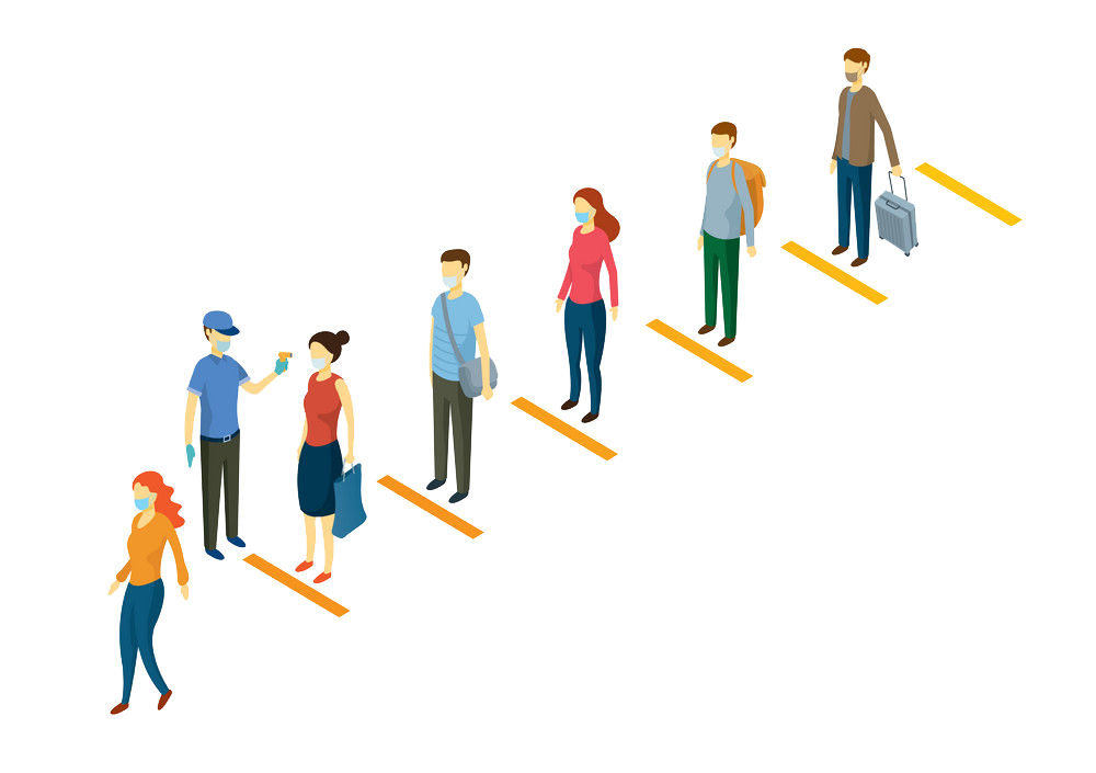
A long line outside a rapid testing clinic is equal in threat to spread as an overcrowded front desk. Limiting long lines begins with real-time patient head-counts from the doctor's office, through the waiting room and out to the street.
"I don't mind walking the extra mile if there are fewer patients in the queue at another clinic."
Bottlenecks
Operational issues are common at healthcare facilities. During times as uncertain as these, notifications from the clinic or hospital are critical, affecting both patient security and waiting times.
"It would be nice to be notified of delays by the front desk and to come back the next day instead of waiting in a queue twice as long as I anticipated."
Providers
The biggest disconnection within the American Healthcare System is between healthcare service and insurance providers. Hours are lost coordinating these efforts in-person at front desks. These are exposure hours we cannot currently afford.
"Am I supposed to fight my insurance provider at the front desk of my healthcare provider and risk catching the virus?"
Emergencies
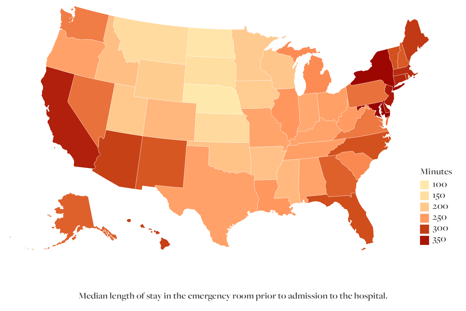
Yes, rapid or regular testing has burdened the global healthcare system. It's hard to remember how crowded emergency rooms were prior to the pandemic and this is a need that will not disappear.
"What if I need the exact distance from the nearest in network hospital with information about covid exposure, in seconds?"
Reviews
Real-time information alone is not reliable. A recorded history of patient experiences will give me an understanding of the clinic or hospital's standard operation procedures (SOP's).
"This isn't like a Prime account. I can't refund or exchange my health. But it would be nice to have an app-interface invested in the same level of customer care as the e-commerce industry."
Who's the competition?
Publicly accessible patient waiting interfaces for smartphones date only as far back as 2014. These platforms have been setup to cater to the needs of our global community during the pandemic of 2020 and beyond. Let's cross reference their key features to better understand their offerings.
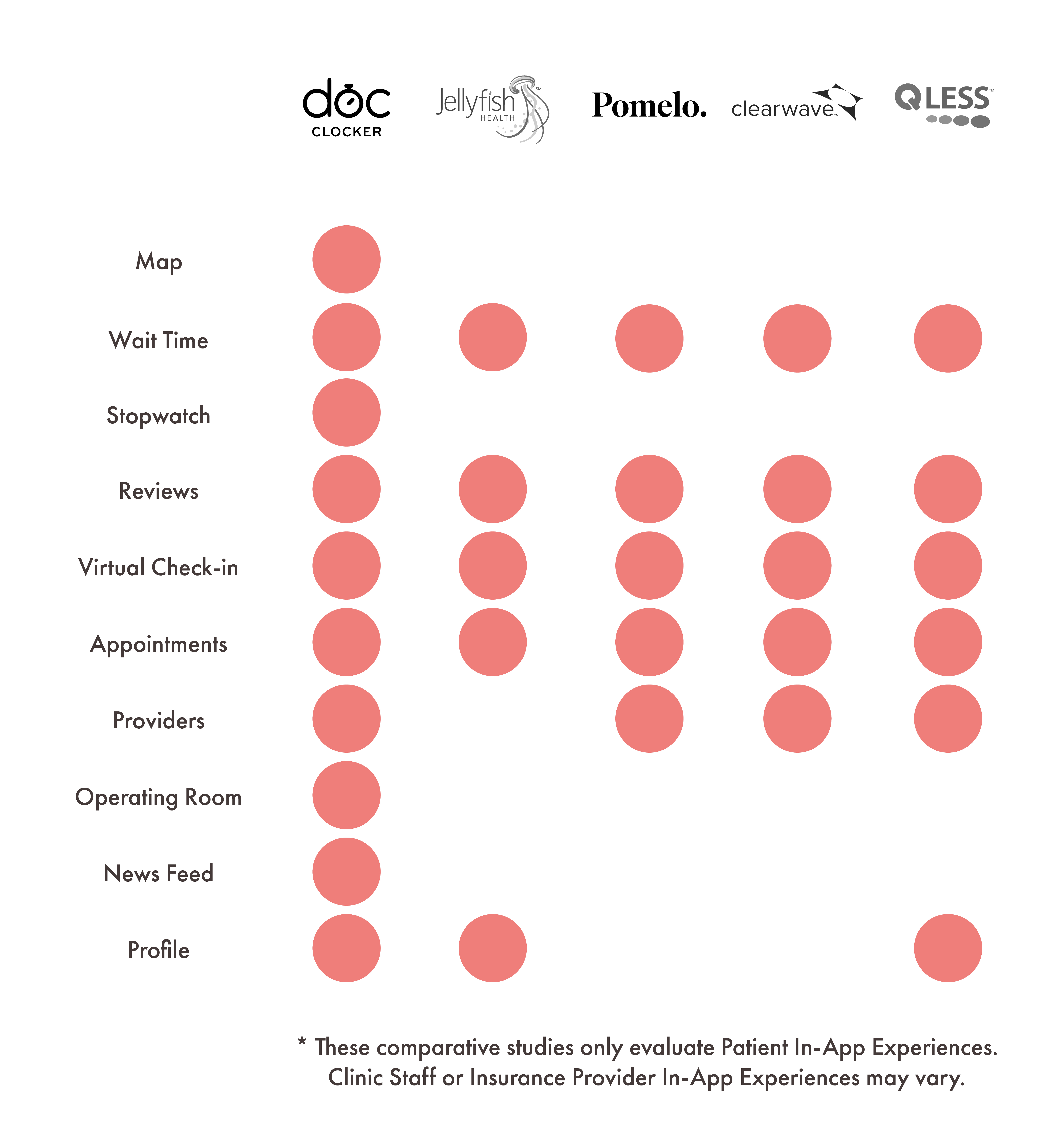
Map
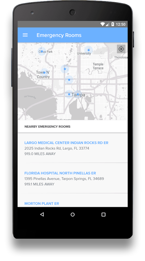
Information accessibility is critical and a map interface is a real-time tool allowing access to be quick and customizable. DocClocker does a great job identifying clinics and hopsitals in close proximity to your shared location.
Wait time
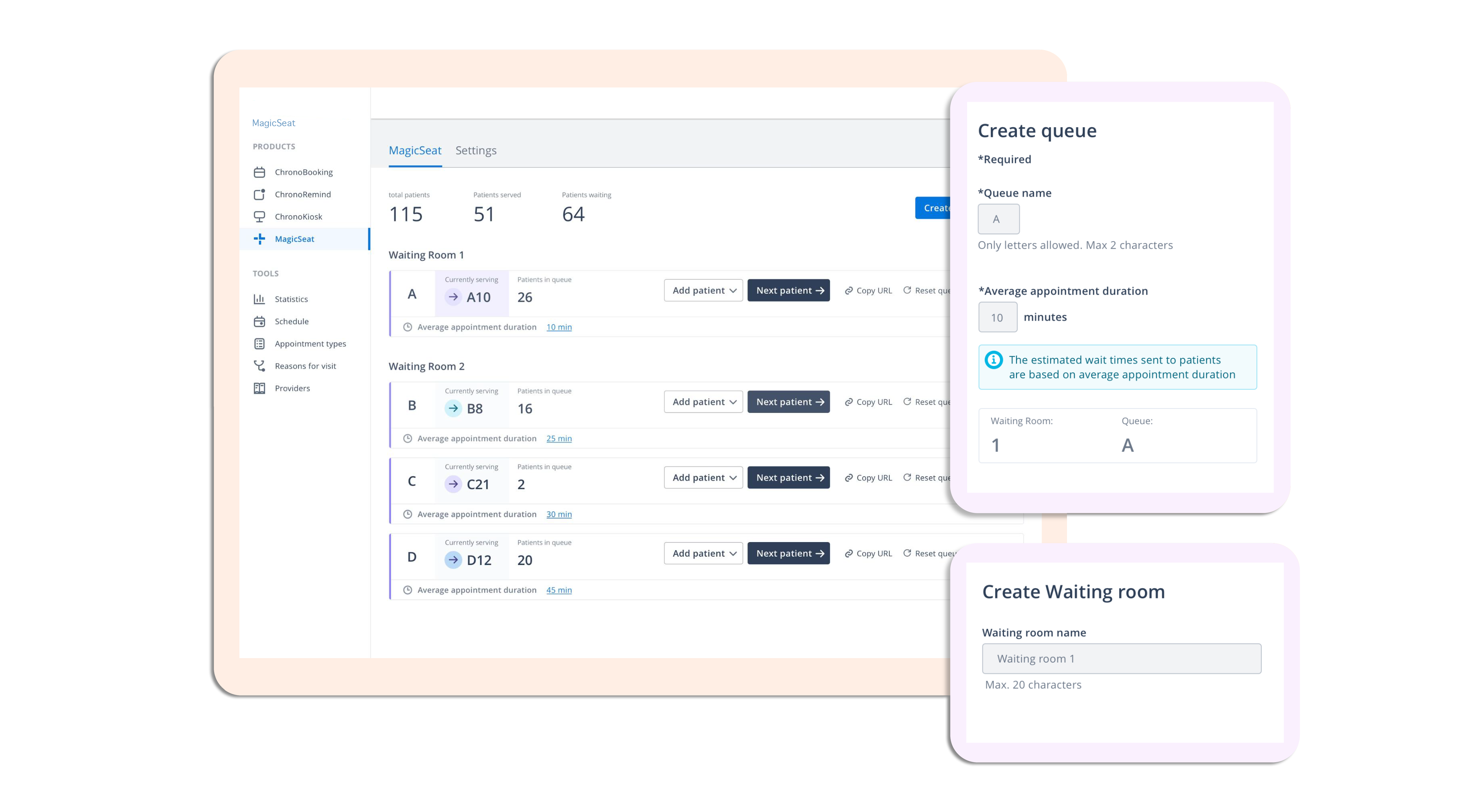
Two factors influence the wait time segment of these digital products: accuracy and interface design. Pomelo does this very well. A look under the hood for the healthcare staff's portal allows us to understand the system at work with full transparency. Keeping waiting times consistent, current and therby efficient will make or break a virtual waiting room offering.
Secondly, with an effective UI-Kit, one is able to reduce cognitive overload, identifying bottlenecks and streamlining the patient's visit end-to-end. Keep it simple and accessible.
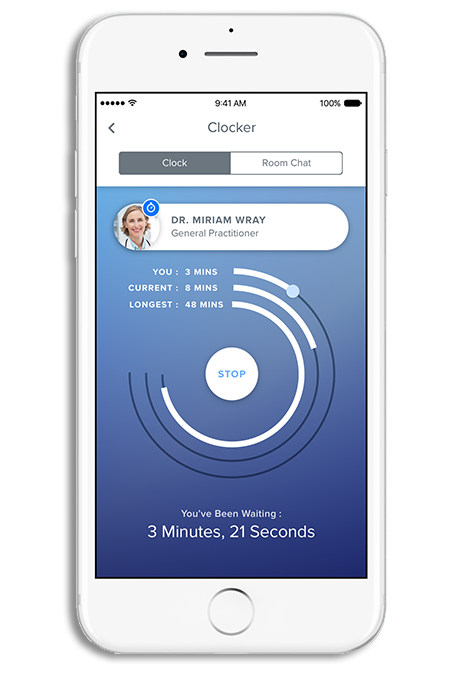
Stopwatch
The advent of the timer feature has put power into the hands of the patient. While this feature is reliant on patient participation, the averages are instant indicators that directly influence a potential customer's decision to visit or seek care elsewhere. The timer can be overlayed with shortest, longest, previous and current patient experiences to make an informed decision.
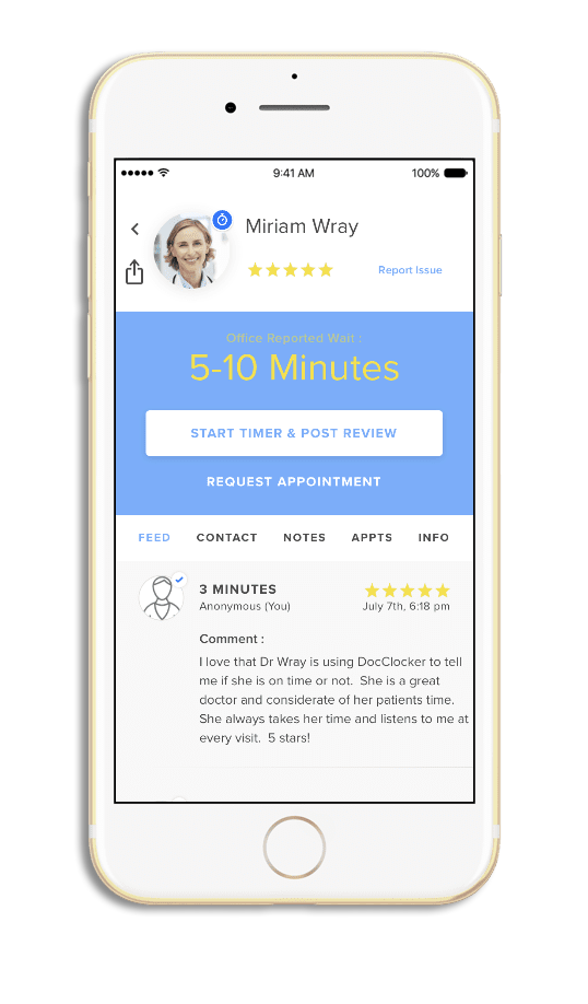
Reviews
With substantial design efforts invested in the customer reviewing system by e-commerce retail platforms, similar strategies can be duplicated and adjusted for the healthcare sector. A robust and curated system will benefit the patient and healthcare professional community as customers seek clinics with better end-to-end service while providers get feedback on how to better their offerings.
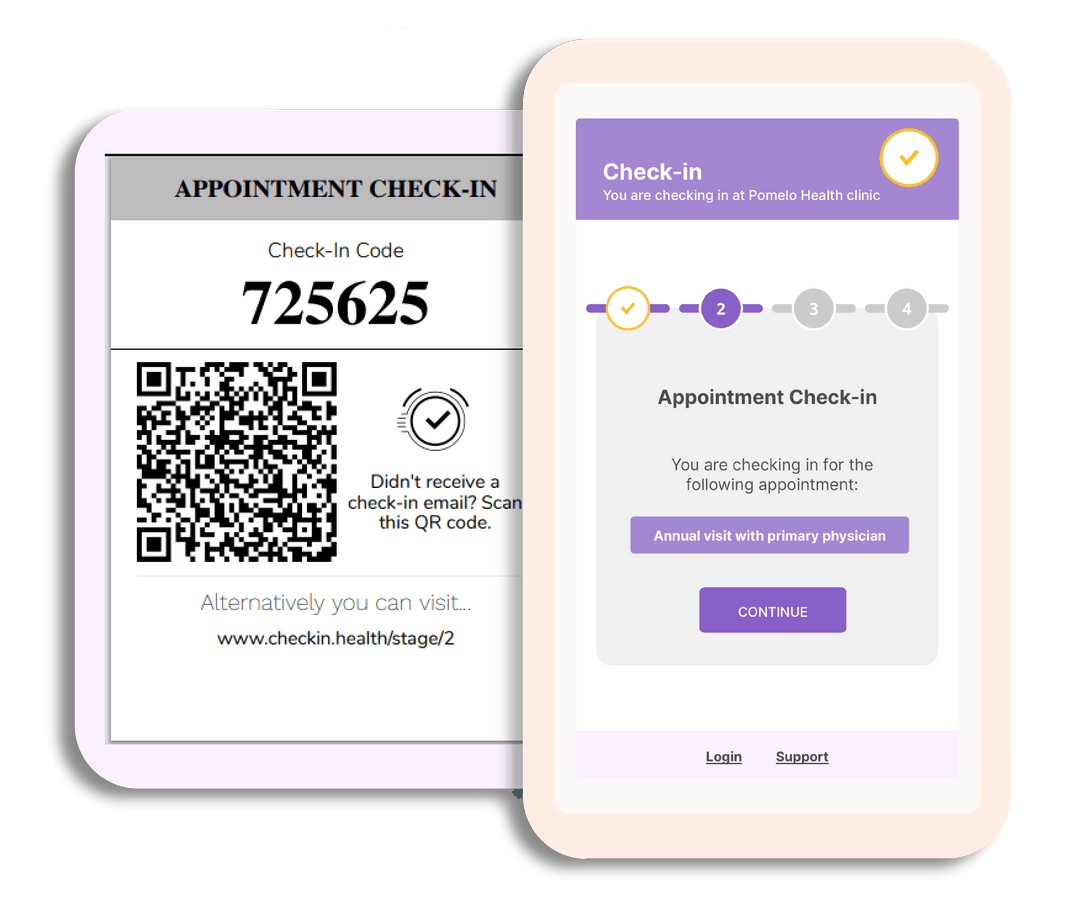
Virtual check-in
If you are waiting in your car outside a clinic or outside and away from the walk-in lines at your local clinic, a simple QR-Code feature is effective in reducing spread from close proximity exposure. Aside from safety, a patient is afforded greater time management and healthcare staff are able to mediate their limited resources with far more efficiency and control. If correctly implemented, waiting rooms may only need to serve the scan-in process.
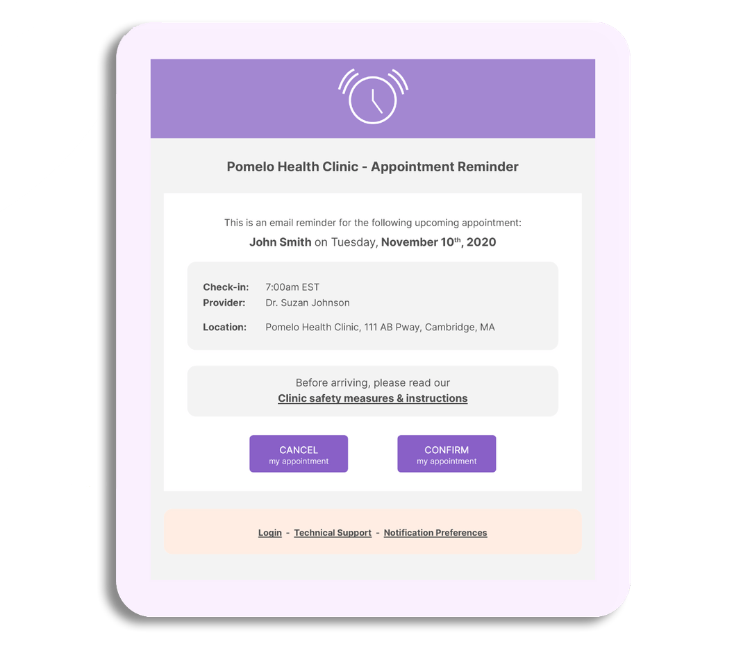
Appointments
Reminders, updates and flexibility can be ensured when appointment tracking is integrated into the same platform. Similar advantages: time management and resource allocation; come into play and if a profile feature is enabled, a healthcare worker need not be tasked to make direct phone calls to confirm a patient's availability for an appointment for the following day.
Providers
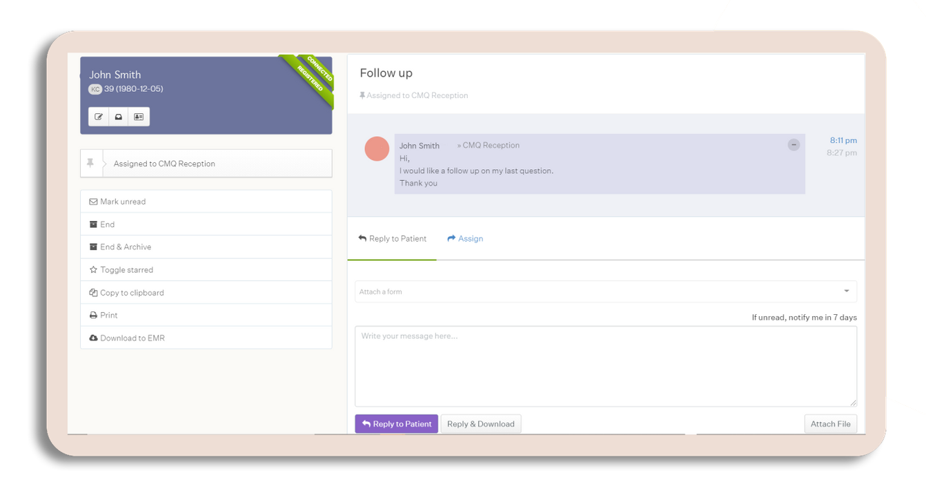
Finding the a healthcare insurance provider to match your clinic or hospital can be an arduous affair. Pre-checks, qualification confirmations, billing and updated information regarding deductables or out-of-pocket costs can certainly be managed using the same digital interface. Providers are afforded clarity but most importantly, patients are given transparency about their coverage. This circumvents the danger of spread when standing for minutes or hours at the front desk at hospital accounting. Providers would be further incentivized to subscribe to a platform preferred by patients.
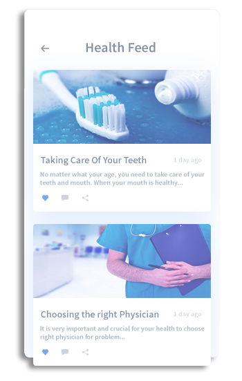
News feed
With a plethora of social media content looped on an infinite scroll, health content is seldom shared outside of pamphlets or brochures. Integrating a feed with regional or global articles, recommendations or shorter reads keeps the community informed and curious.
Profile
Finally, having a profile dashboard is near critical to the success of a healthcare digital platform. Being able to consolidated all the above mention offerings: appointment, history, providers, notifications, reviews and others; keeps patient management simple. Tailoring a profile with doctor history allows for the customer to be notified in the event of a schedule change, bottleneck or virus outbreak at their clinic.
2\ Define the user
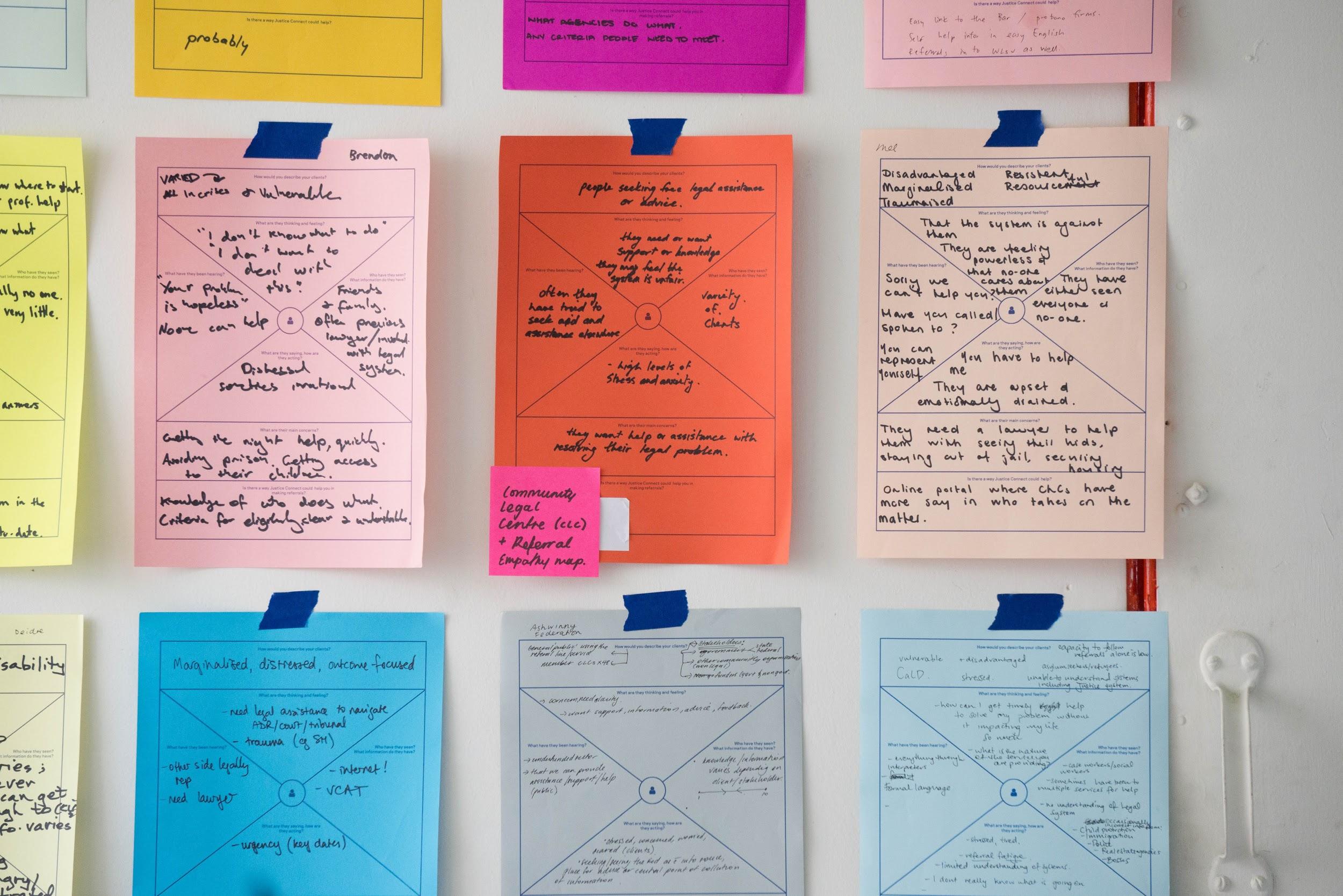
The perspective of the patient is a tool that benefits the research, design and development of the product.
Maintaining effective digital service delivery requires an understanding of how different demographics have varying priorities and responses in regards to healthcare and testing.
Empathy mapping
What is the frequency of a 25 to 35 year-old's testing habits? What are the added considerations given a global pandemic, in the event of an emergency? Can an elder patient navigate through a digital portal to address all their insurance, appointment and alert needs independently?
A human-centered design experience takes the patient to the forefront of the process. No requirements are obvious and some develop over further investigation. Some potential users are unaware of digital offerings available elsewhere and introducing these with local-level requests creates a more robust platform at a global scale.
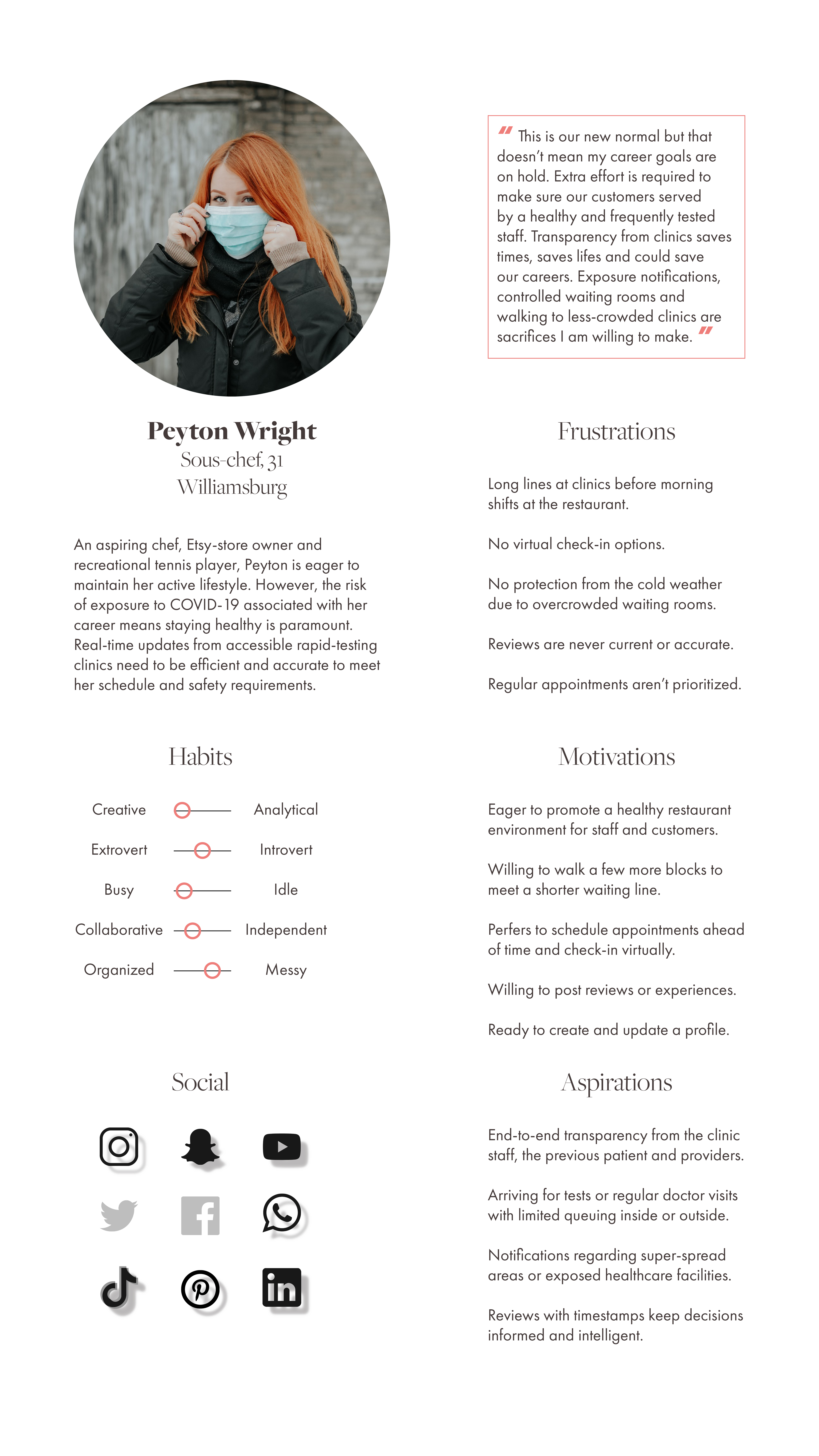
Let's meet our user!
Perhaps the most impacted on a daily basis are non-essential, hospitality workers who are young in their careers, are fortunate to have retained employment, are in high-exposure enviornments and are only able to access overcrowded clinics for weekly rapid-testing in the heart of a metropolis.
Let's look at an example, our potential user, Peyton Wright.
3\ Ideate the experience
Keeping a macro user flow lens will allows for a choreography of the interactions to be intentional, functional and essential to the services provided.
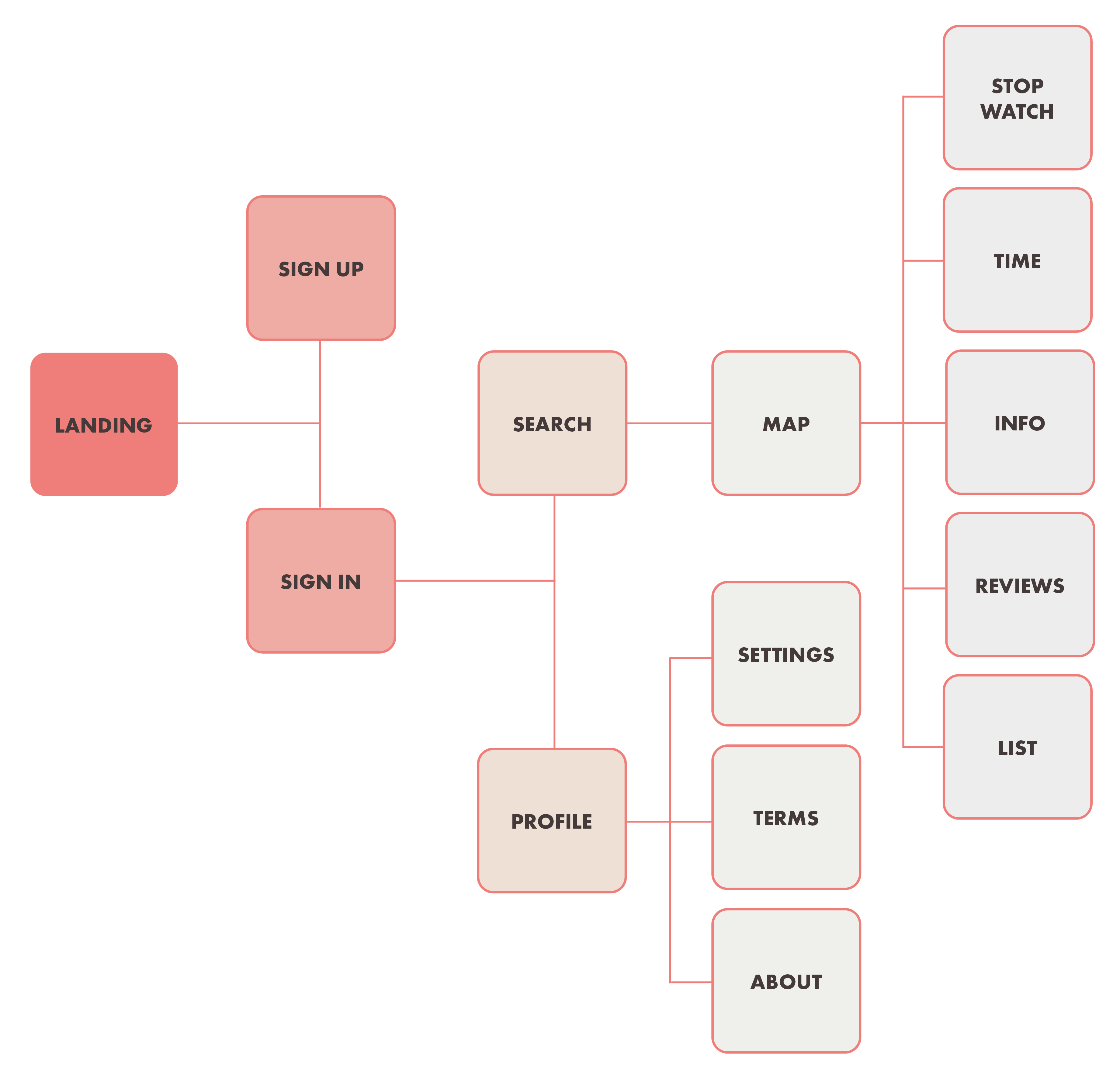
With a network of complex features, it is important to consolidate these when possible to curated tabs. This can be best illustrated using a site map.
Site mapping
Keeping overlays and alerts limited may be essential but even more important is maintaining fluidity within a unifying dashboard. Allowing for tabs in a single portal with curated information sets reduces cognitive overloads, increases access to pertinent information and important updates.
While the time, information, reviews and others tabs will carry the functional weight of securing health services, supplementary features; profile, stopwatch and sign-ups will be developed with a consistently minimal UI-Kit, allowing for the information to take center-stage over extraneous motion graphics.
Keeping your data safe
Location sharing is default enabled to be allowed only while using the product. While the benefits of live location allow for more accurate recommendations, in this era of cyber security awareness, all applications must take privacy into considerations.
Allowing for an external provider to manage billing and credit card information means a patient's in-app profile need not store details of this nature. With ApplePay and PayPal leading the forefront on digital wallet access, integration with these iOS or Android features will keep financial and social security credentials outside of this offering.
4\ Wireframing
Identifying all the motivations, aspirations and cautionary tales from competitive products and and our user persona study, we will begin building our product in three stages prior to user testing.
A low-fidelity mockup will serve to roadmap the user's journey. A mid-fidelity prototype will identify UI-Kit distribution. A high-fidelity prototype will animate the user's journey.
Low-fidelity prototype
To choreograph this digital product, it is important to address all component possibilities within each screen. Developing a hierarchy of information is helpful here.
Given the large demographic range, it is in our best interest to keep elements and animations minimal at inception. The bulk of the detail set will arrive in tabs for the middle of the digital experience, i.e. clinic contact numnbers, hours of operation and average waiting time. Reviews will also be found here. The tail-end of the product will be the stopwatch and feedback portal, ending with a minimal screen layout, similar to the sign in landing screen, giving the end-to-end journey a holistic, curated feel.
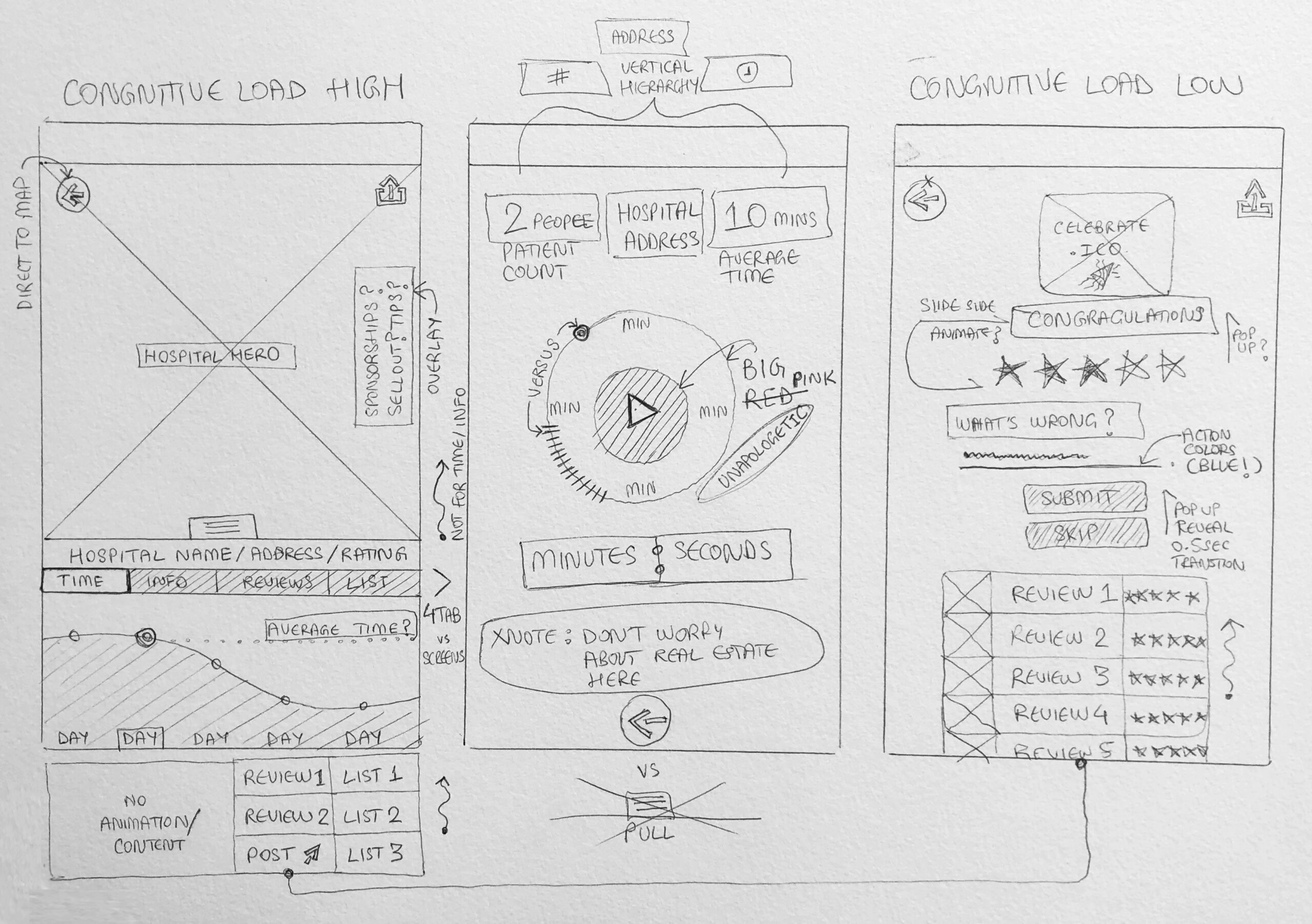
Mid-fidelity prototype
Softwares used to create these boards include Balsamiq and Adobe Creative Cloud. Creatig mid-fidelity prototypes for this digital products allows a layer where iconography, interface organization and overlay metrics can be determined.
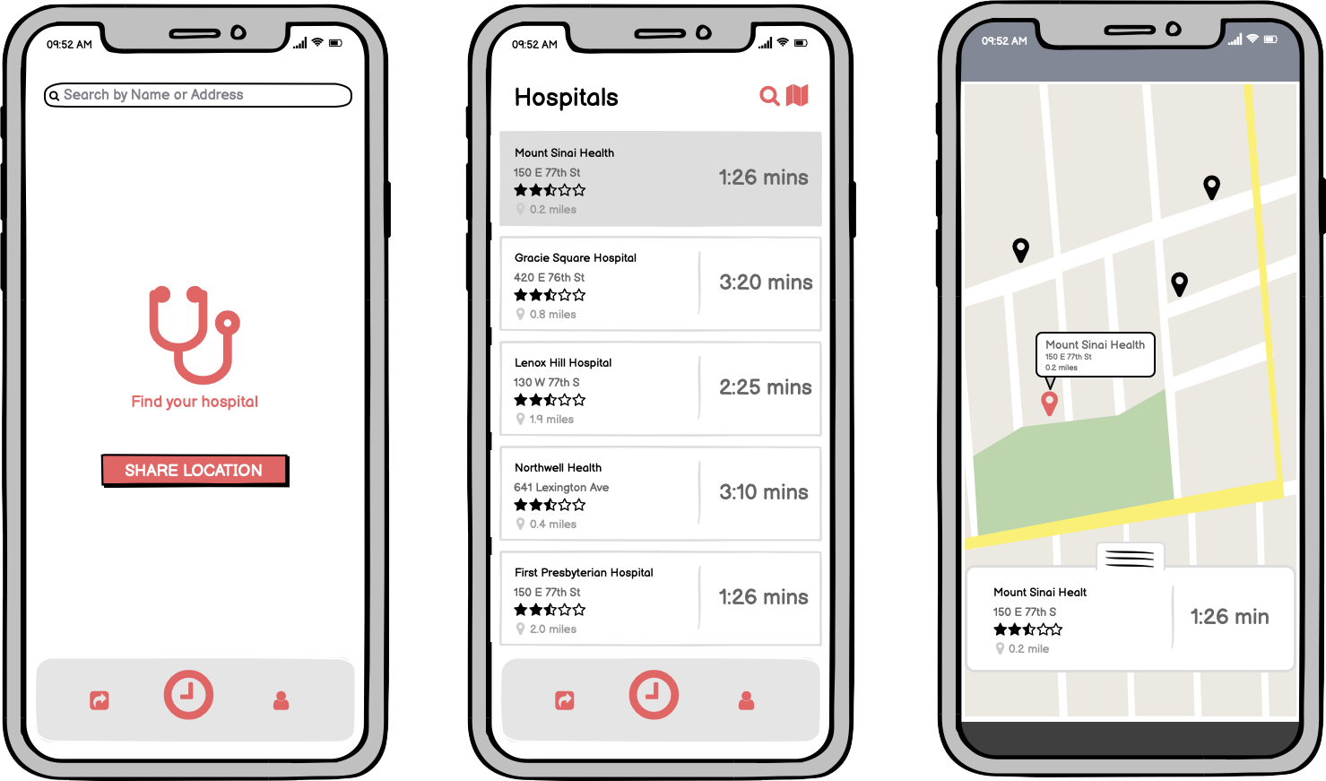
Map
After a prompt to share a user's location only while using the app, the potential patient is led to a series of clinics and hospitals available with corresponding details. Reviews, addresses and distances can promptly be screened. A key feature here is the average wait time, updated in real-time. Upon selection, a map interface opens up to reveal the selected option.
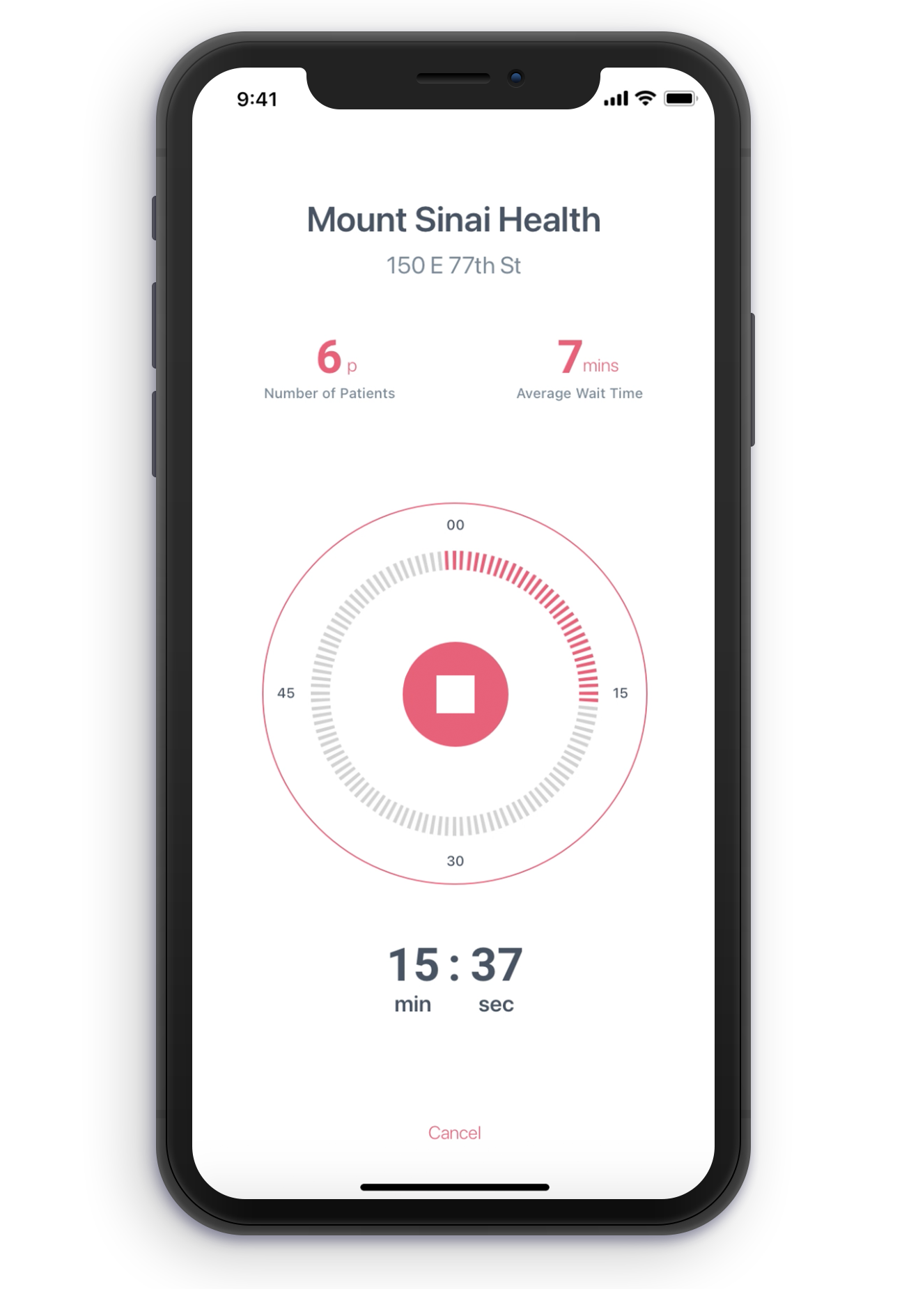
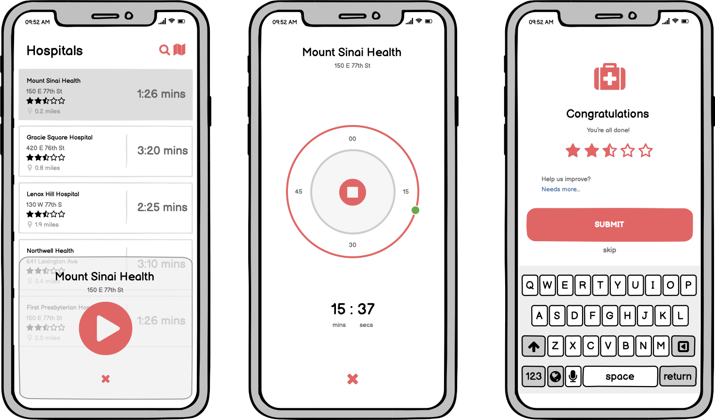
Stopwatch
The power behind this product lies in user participation. While average wait times can be accrued over time, the stopwatch feature creates a live loop with the clinic or hospital. This timer may be activated remotely or at the location. Shortly after, the review dialog appears to add feedback and comments to patient experience.
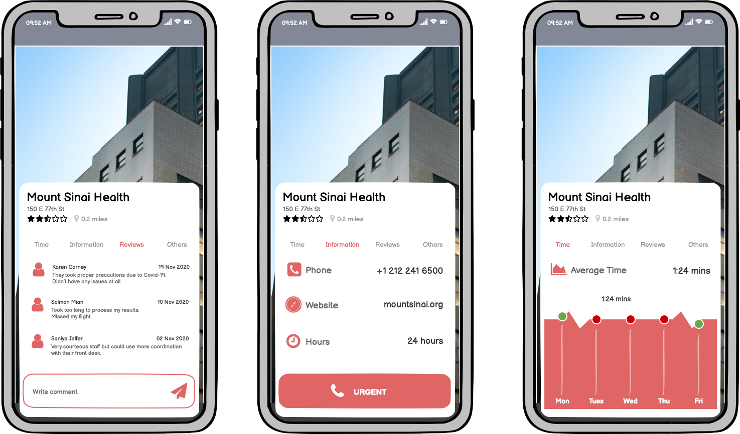
Dashboard
This screen consolidates detailed information regarding the clinic or hospital selected from the menu or the map interface. Average wait times are visualized with days layered on for added transparency. Contact information, website URL's and hours of operation are added as a tab within this dashboard as well. A list of adjacent locations are provided in a tab here as well, alongside the review dialog hosting previous patient experiences.
5\ Interactions
Given the demographic range and urgent need for a digital platform of this nature, a simple UI-Kit is not enough to create an optimal user experience.
Each action is curated to cater to a wider audience. The primary goal is to provide quick access to critical information.
High-fidelity prototype
Softwares used to create these these high-fidelity prototypes and animations include Sketch, Adobe Creative Cloud and Principle. With these a developer is afforded detailed insights into micro-animations as a user interacts with the product. For stake-holders, it is an opportunity to market the product during the development process for further fund-raising efforts.
Sign in or Sign up
The landing screen for the iOS product allows guests to sign up for the service free of charge, or have returning patients sign in. The aim is to consolidate information for ease of access. This assists with scheduling follow-ups and if opted for, receiving notifications regarding virus exposure at their visited clinics or in their local community.
Map
Upon sharing location, the platform first presents a listed view. The curated information adjacent to the average wait time prompts the map interface after selection. One is able to toggle between map view and list view as they prefer.
Dashboard
Keeping information fluid and transitions quick, a user can cycle through all pertinent information about their clinic or hospital without having to refer to any external links. With greater access to these details, a patient is able to make an informed decision regarding over-crowded areas, times or limited hour services within their community.
Reviews
The ability to post a review within the interface using their profile or anonymously creates awareness. This is a difficult time amidst a pandemic which means healthcare facilities are trying to play catch-up. As a result, these review portals are equally helpful in maintaining standard operation procedures and identifying which clinics or hospitals are able to provide regular services outside of rapid testing.
Profile
Keeping all credentials in one place makes scheduling appointments, checking visit history and adding alternative facility options more convenient. A direct link to the terms and agreements is also available using this page alongside the digital platform's mission statement. Transparency is key.
6\ Development
To expedite the process of designer to developer delivery, the handshake platform used for this product is Zeplin.
The hope is to translate the Sketch Library of Components and Symbols in accordance with Apple's Human Interface Guidlines for post-launch retrospectives and aid with by-product sprints.
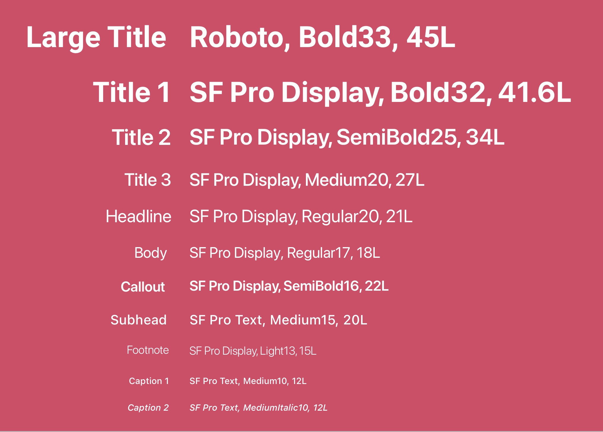
Text styles
If the design system remains resilient through the development process, this allows for product updates most launch to be executed smoothly. The typography for this product was selected to be a catalog of sans-serif typefaces. In the event of an emergency or rapid-testing needs, critical details need to be distributed immediately which remains the primary driver for the UI-Kit.
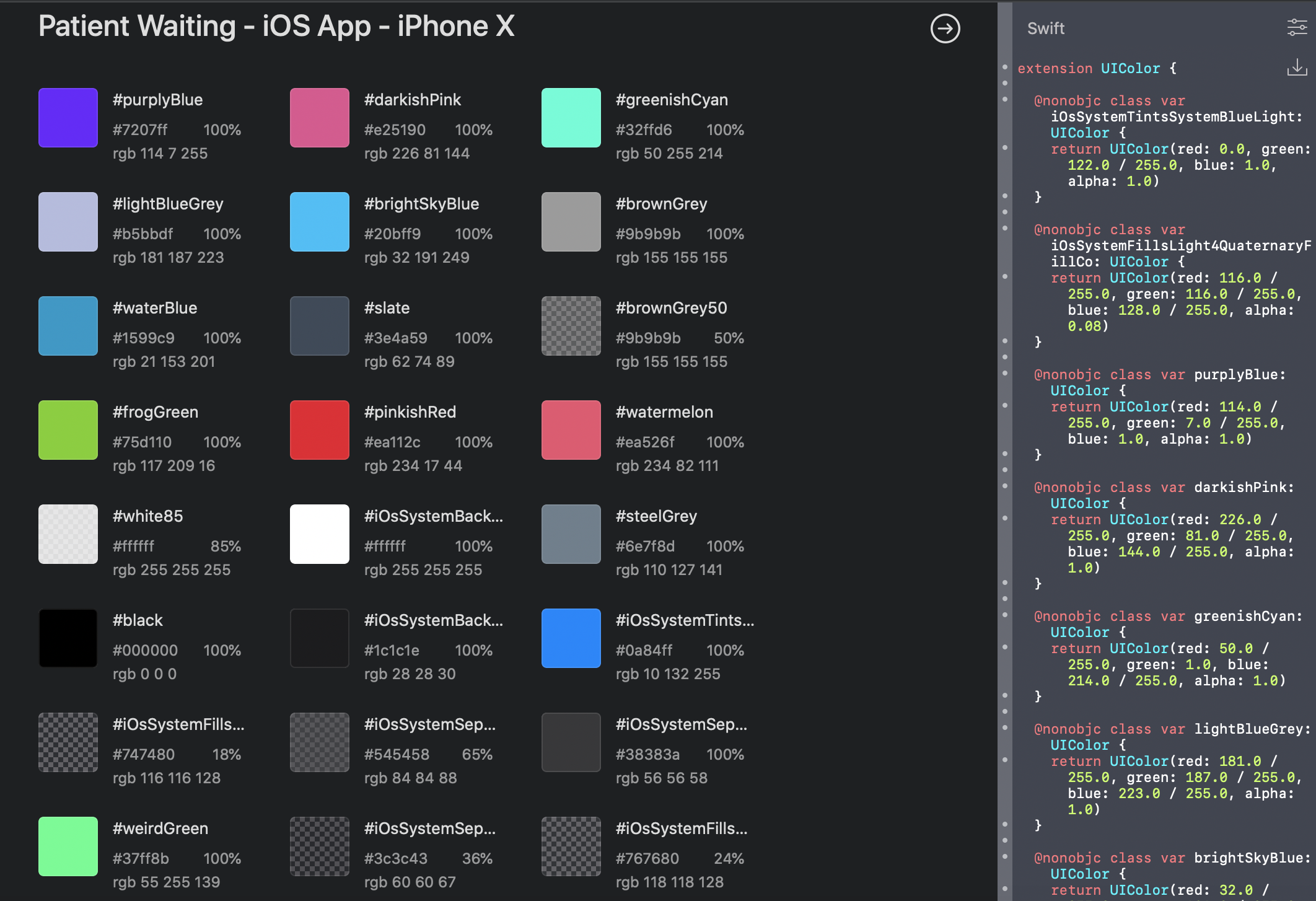
camelCase
Consolidating the color palette for the product to a primary, secondary, tertiary, black and white allows for a holistic user experience to be maintained through each screen. The Sketch Library was generated in accordance with developer standards to maintain efficient handshake protocols.
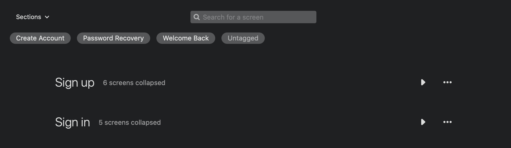
Tags
Within the Zeplin Dashboard, each exported screen is filtered into sections. Tagging user function was also treated as an opportunity to edit out duplicate interactions.
And we're off!

7\ Meet the Team
Hi! This independent research study and prototype comes at a time when our global society is at an economic stand still. Designers, developers and stakeholders need to come together to reinvent strategies to revitalize our communities.
Please feel free to download the free prototype and animation files shared above. Any and all feedback is very much appreciated!

Farhan Mian
Product Designer
FARHAN MIAN
User Experience Designer
User Interface Designer
Architectural Designer
CONTACT ME
farhanahmedmian@gmail.com
CURRENT LOCATION
New York, NY